Categorie: Geen onderdeel van een categorie
Jasper Morrison expands wood and steel furniture collection for Maruni
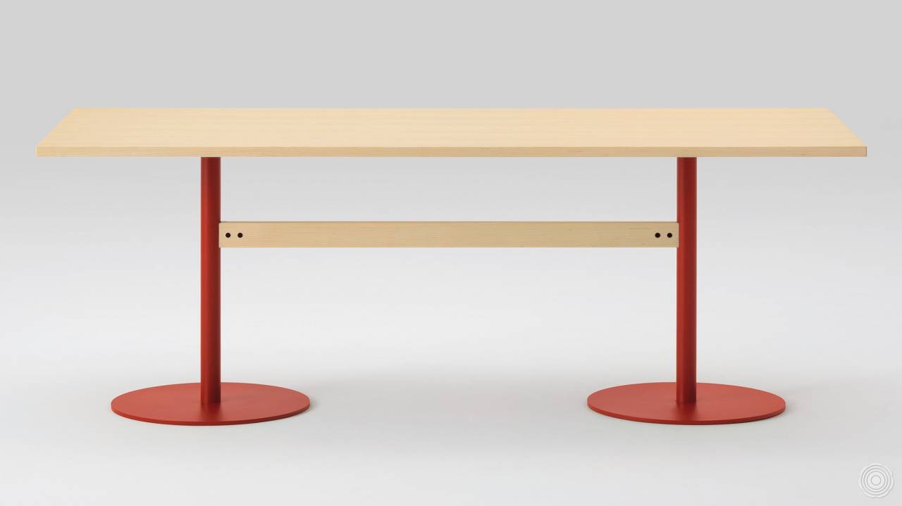
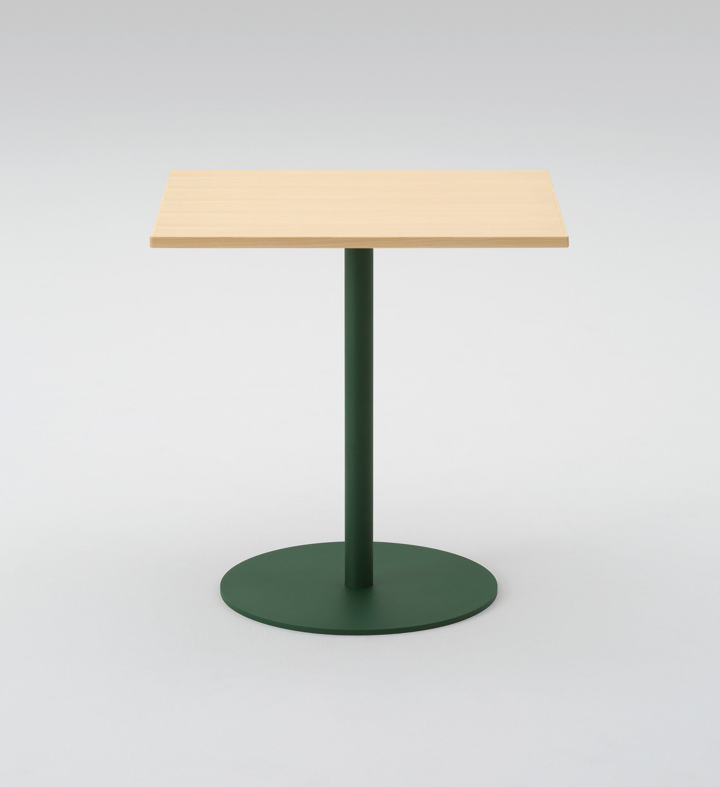
Subtle shapes of letters peek out from British designer Jasper Morrison’s newly expanded T&O furniture collection for Japanese brand Maruni. Morrison has added a pair of tables to the range, both featuring painted steel elements. They were revealed at Salone del Mobile in April.His rectangular T&O table sits on red steel legs with circular bases, and a smaller circular table is supported by a similarly shaped metal stem.
“There’s nothing unusual about using wood and steel together, but I realised by using it in the middle of the chair between wooden parts and with colour, it would bring something fresh to this typology of chair,” Morrison told Dezeen.
The T&O collection is named for its resemblance to the two letters, with the crossbar of the T and the roundness and counter of the O reflected in the table and chair he first designed for the range, in 2016. Both of these pieces are now also available in ash.
“I like the way the round base contrasts the square tops, and the way the legs of the longer tables are joined with a wooden bar so that the metal is between wooden elements,” added Morrison.
“I think it can work at home or in certain kinds of cafe. I saw some in a Tsutaya bookstore in Japan recently.”
Source: Dezeen
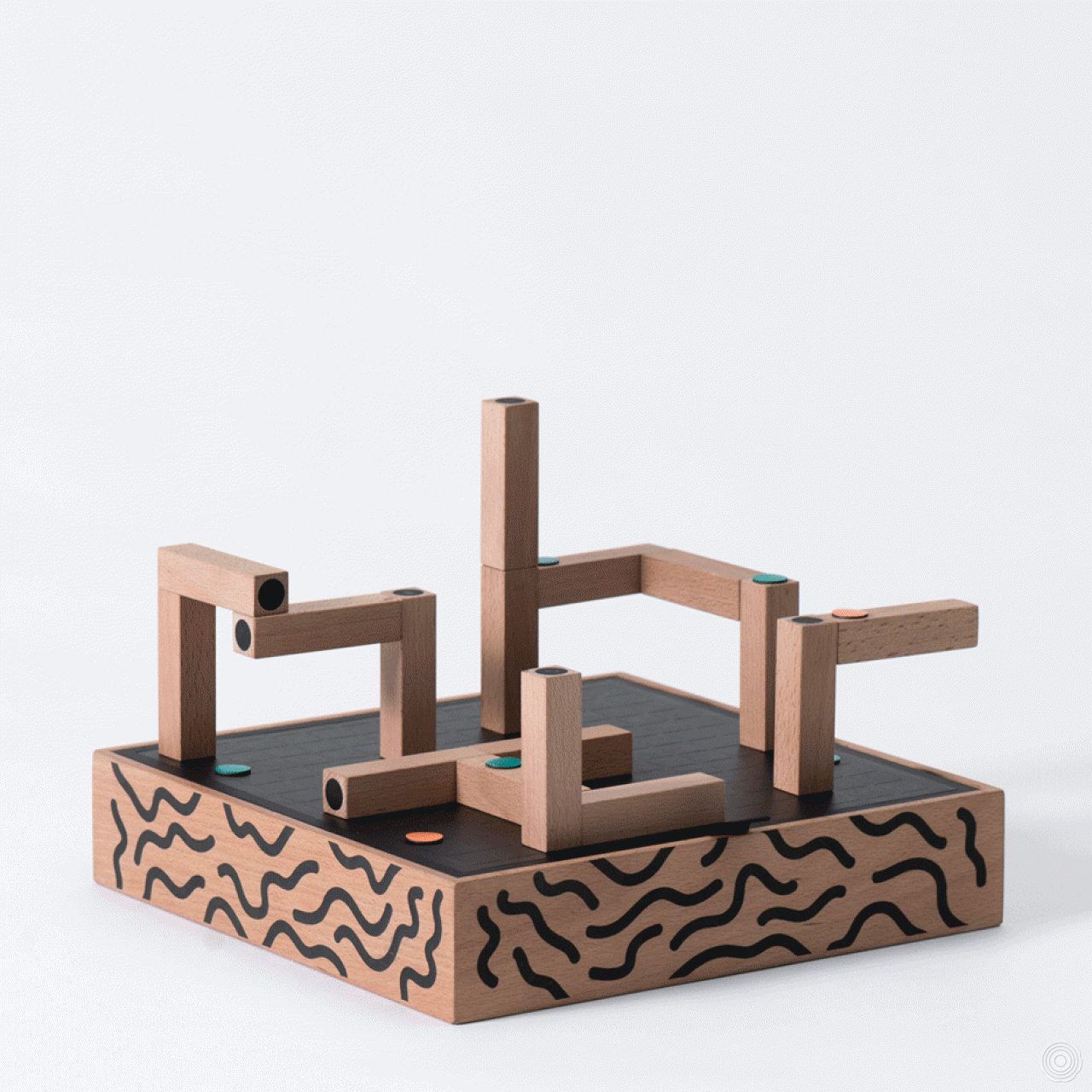
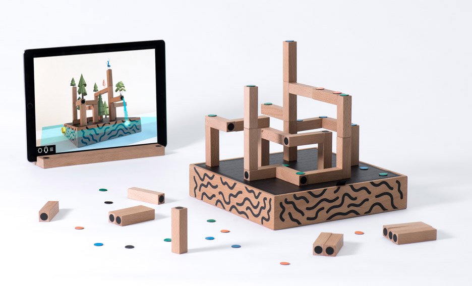
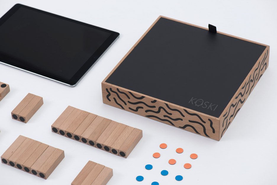
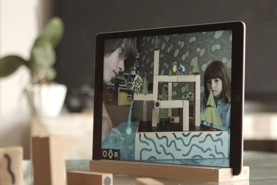
KOSKI is a board game that connects the physical and digital gaming worlds together in a new, unusual and playful way.
It is a combination of real toy blocks and a virtual app that evokes digital interactive game play.
The Player uses an iPad as a “magical mirror” which looks onto wooden blocks. By using an augmented reality and object recognition,
as the player interacts and builds with the blocks, the game soon begins to reveal it’s hidden worlds, characters and stories.
It unlocks new and imaginative ways to play.
‘ Koski is like Lego with augmented reality, but more fun than that sounds.’
— Micah Singleton, The Verge
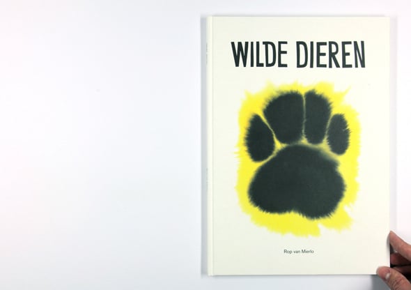
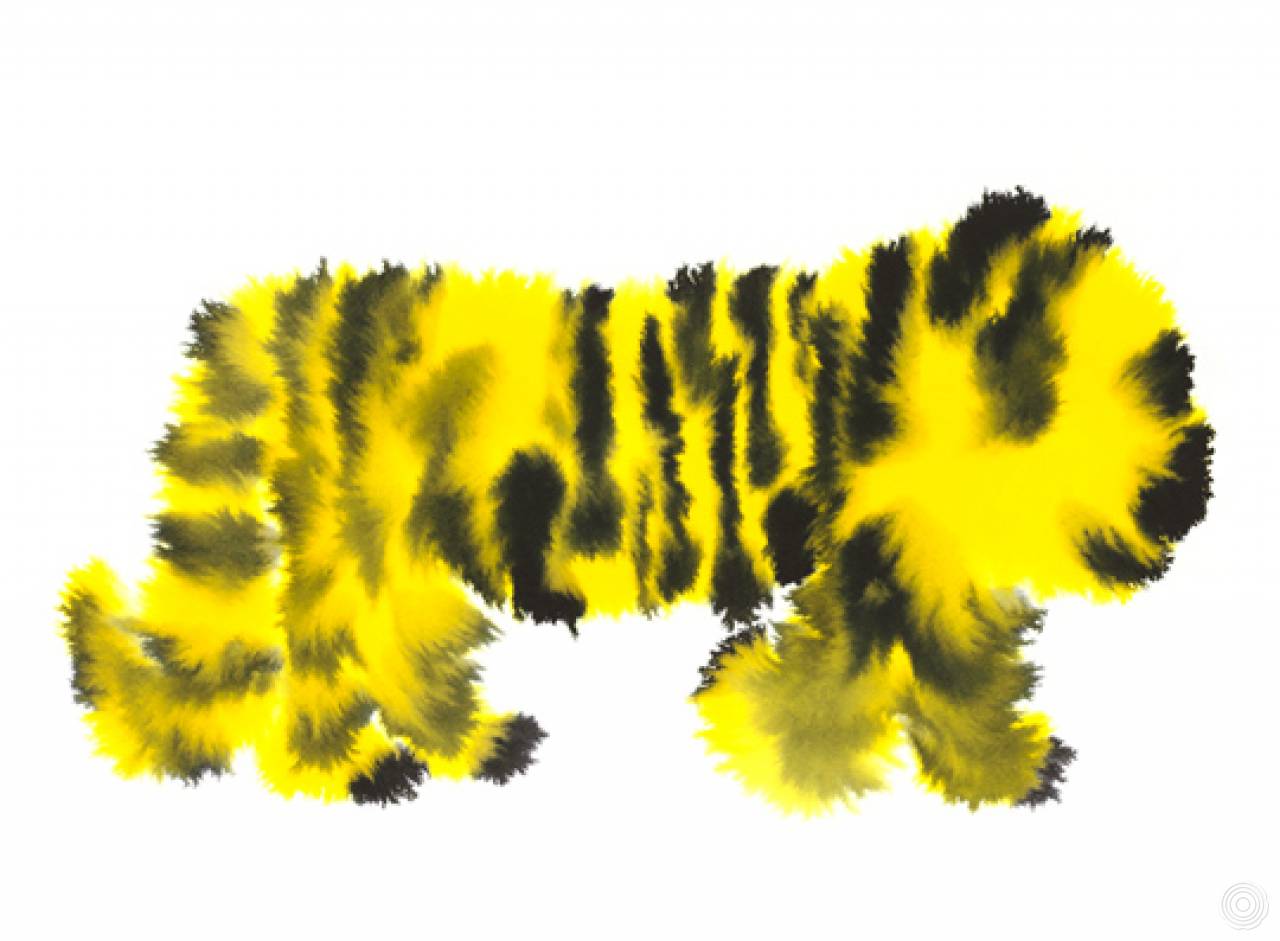
He is a man. He is fascinated by people, the human condition, and its strange consequences.
He once had a dog that bit off the tip of his ear.
Source: Rop van Mierlo

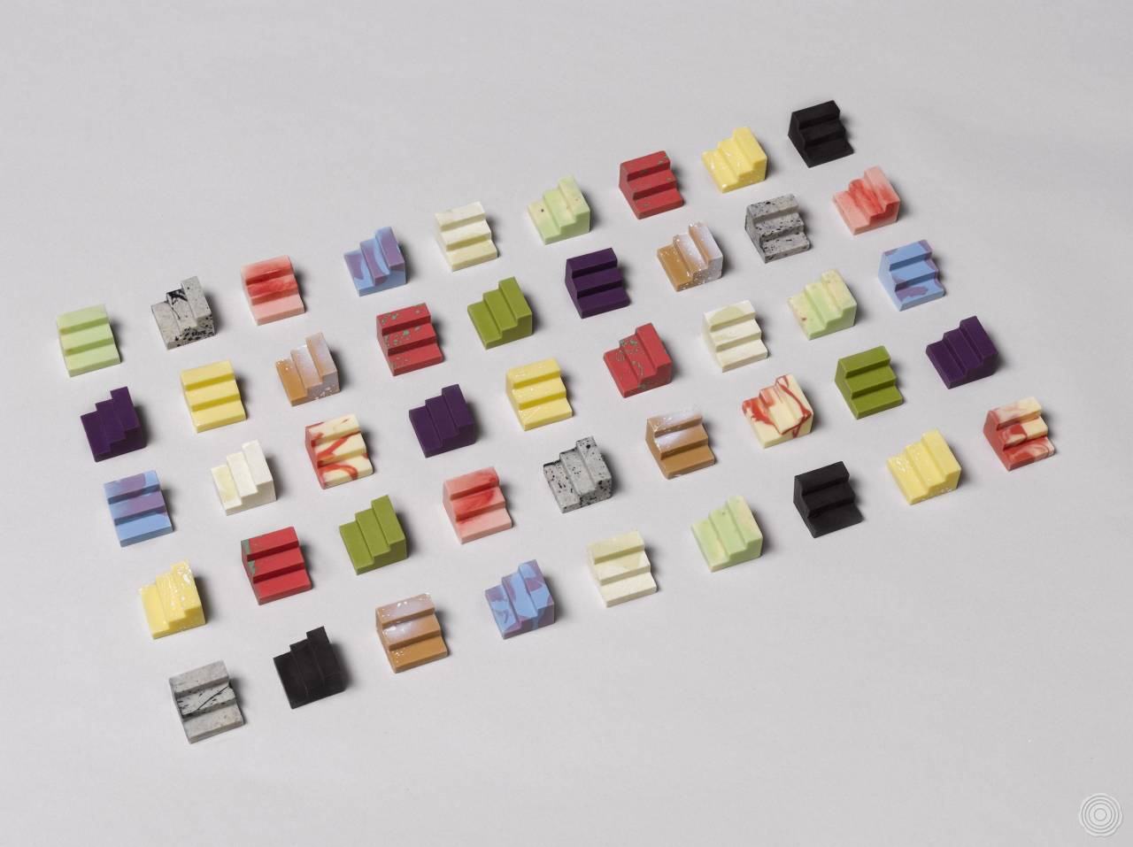
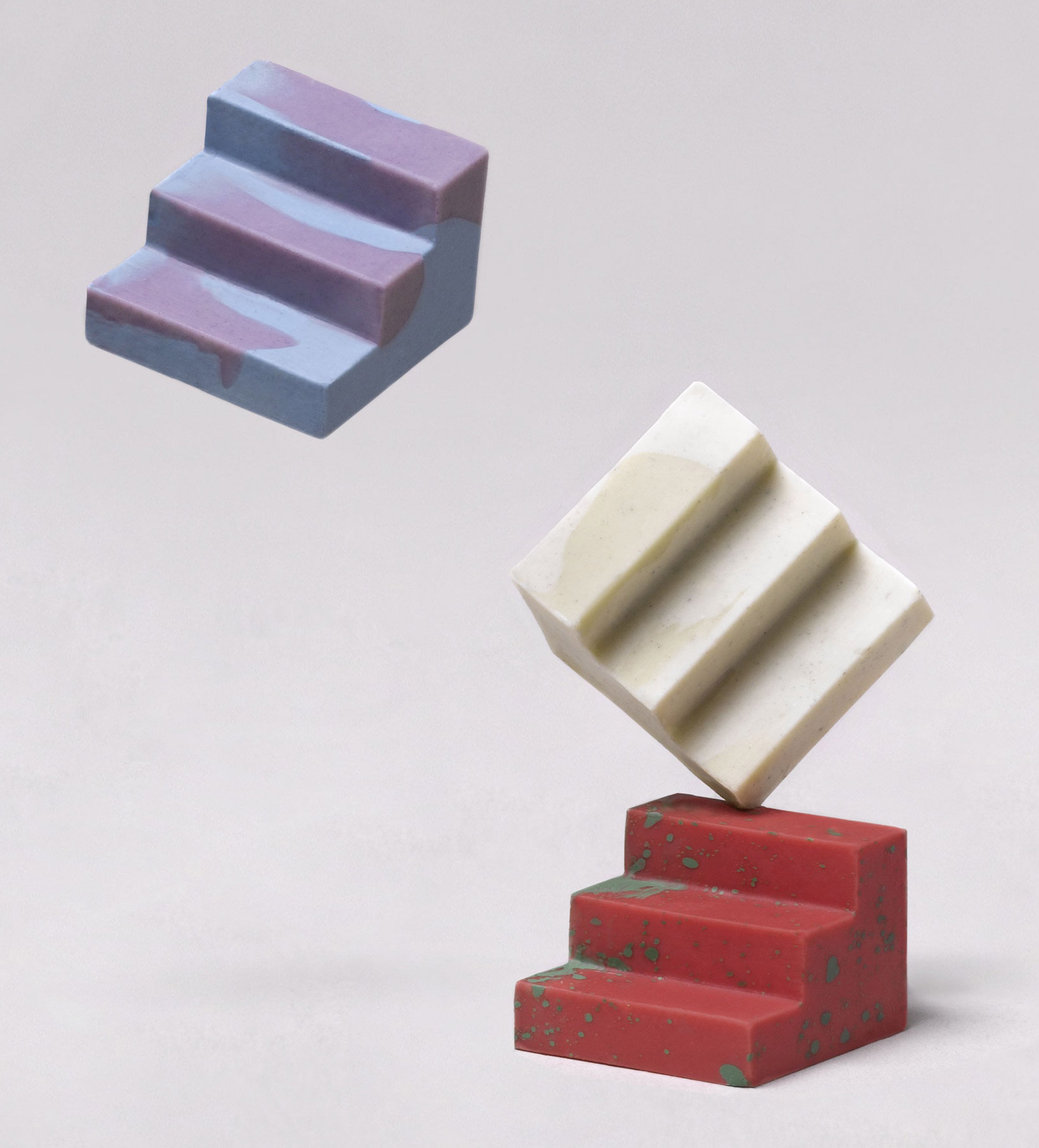
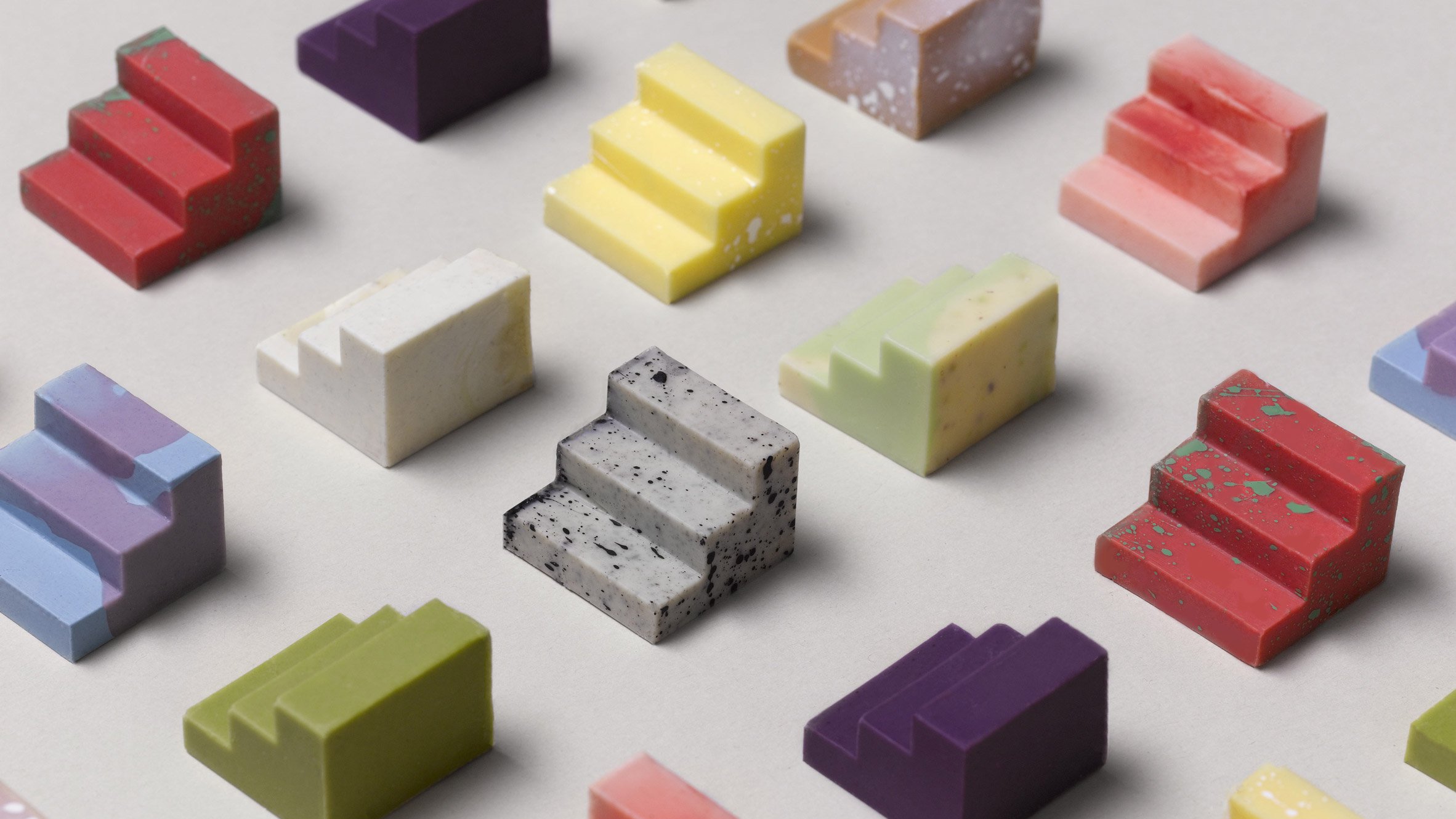
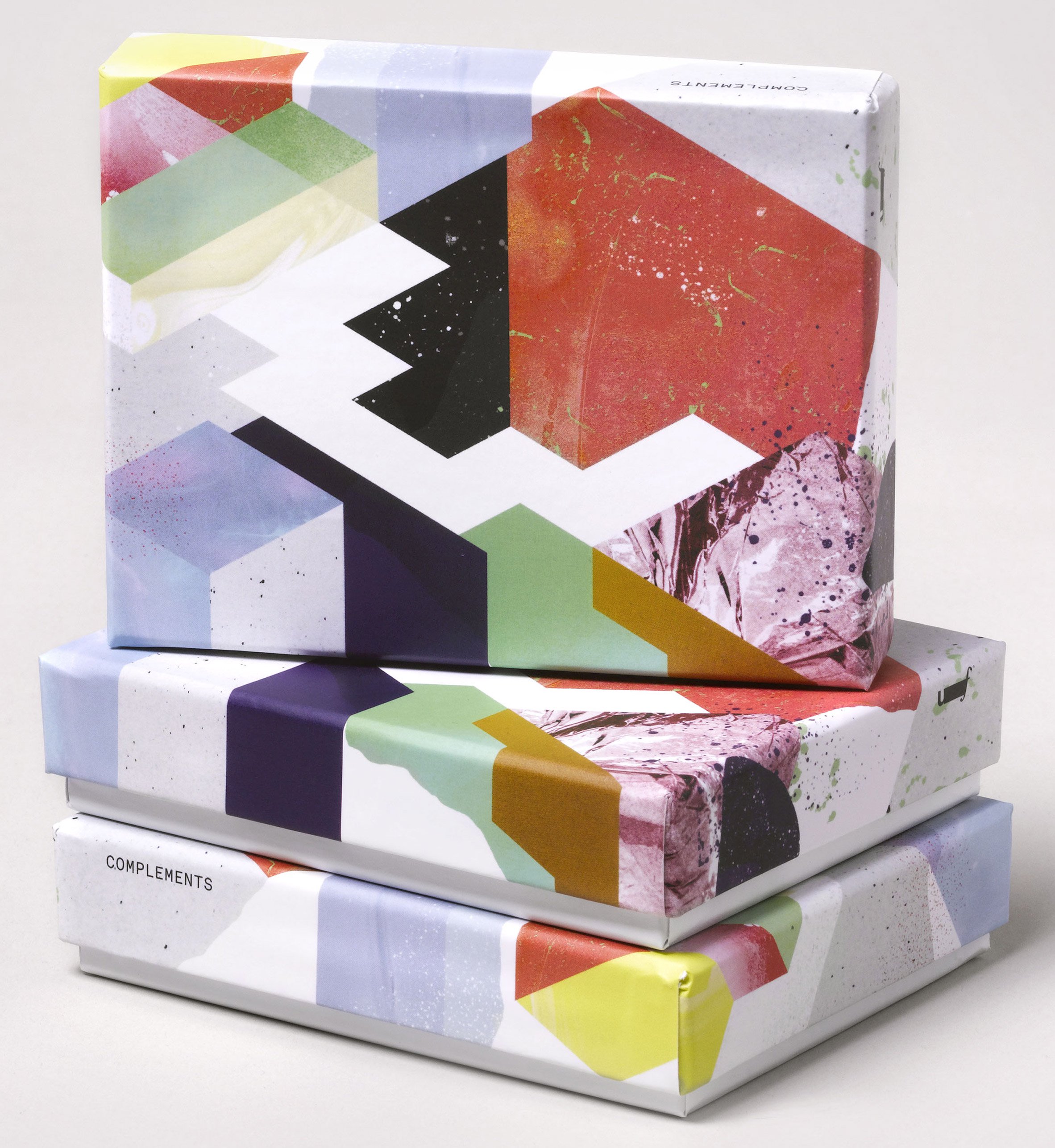
Australian design studio Universal Favourite recently created this awesome project called ‘Complements’.
A simple modular system mad out of chocolate to pair and share, which they made for their 2016 end of year client gifts. Blending 3D printing, design and a collaboration with the amazing chocolatier Bakedown Cakery. These modular chocolates combine in form and flavour to make something special and if you’re feeling lucky, you can enter to win your very own box to pair and share.
Source: Trendland
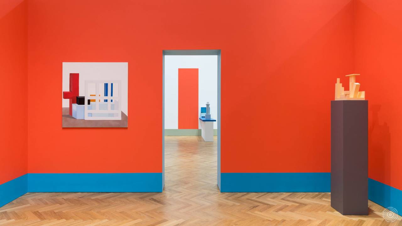
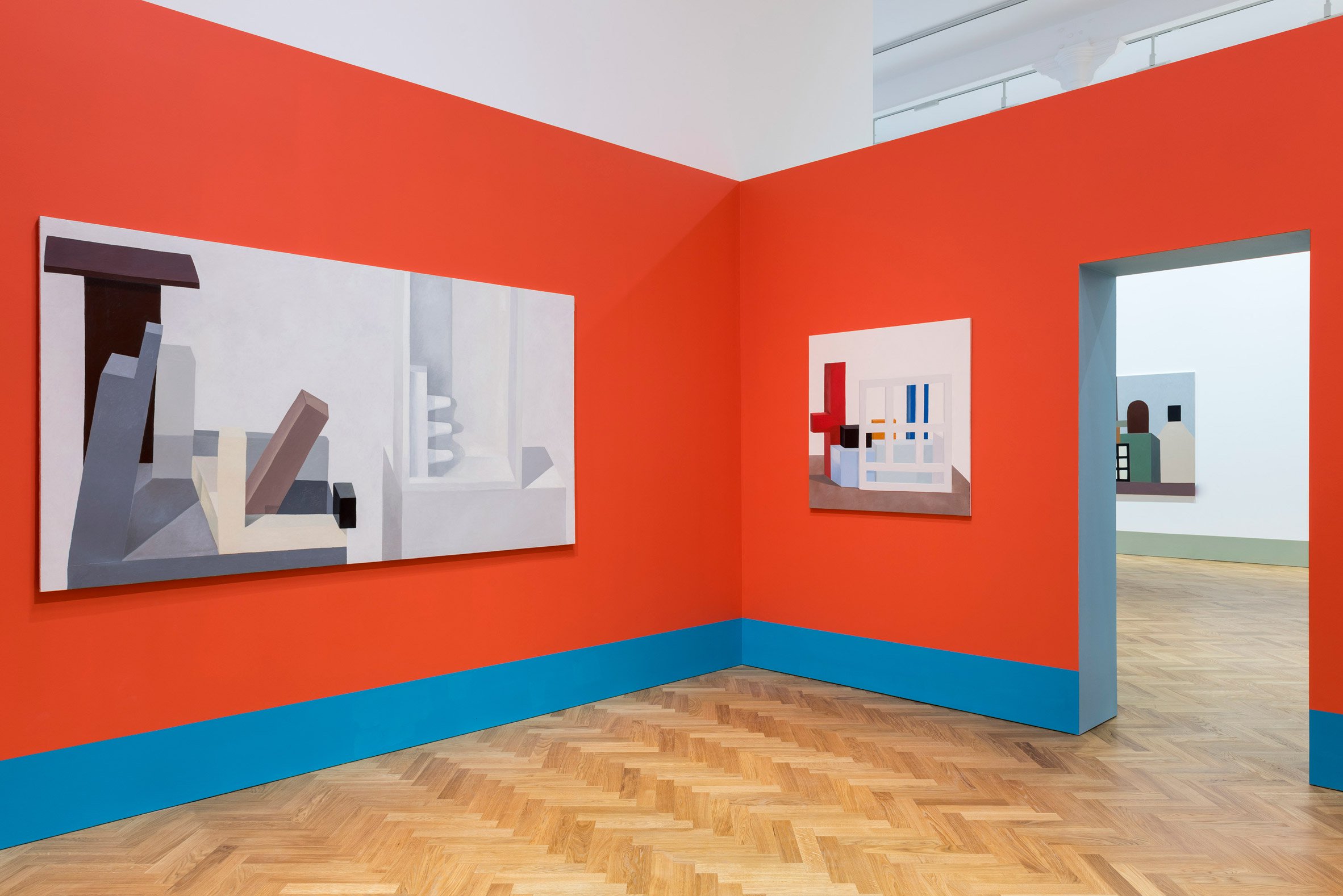
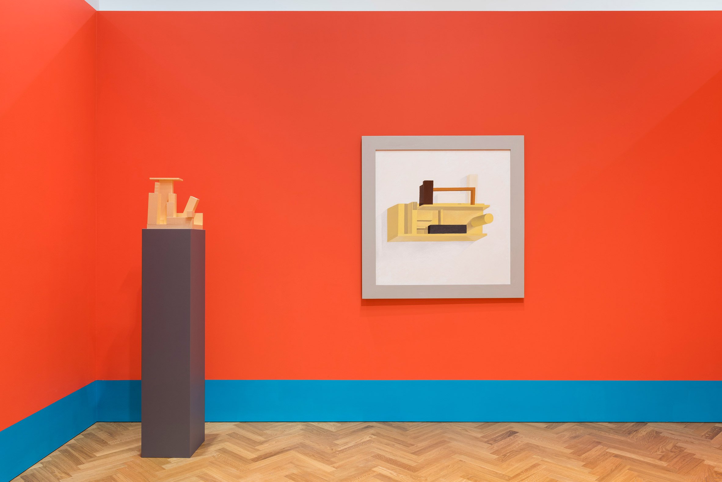
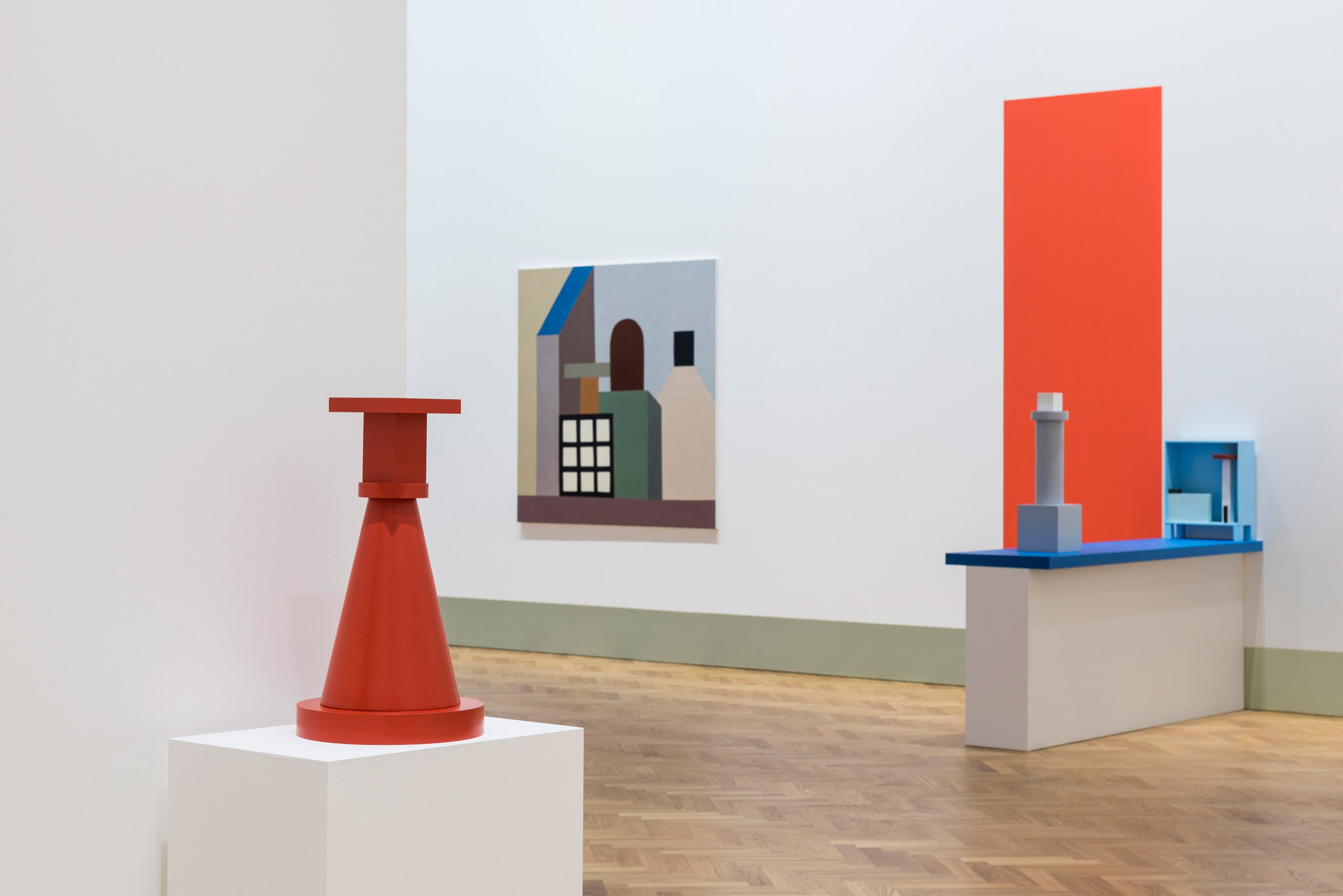
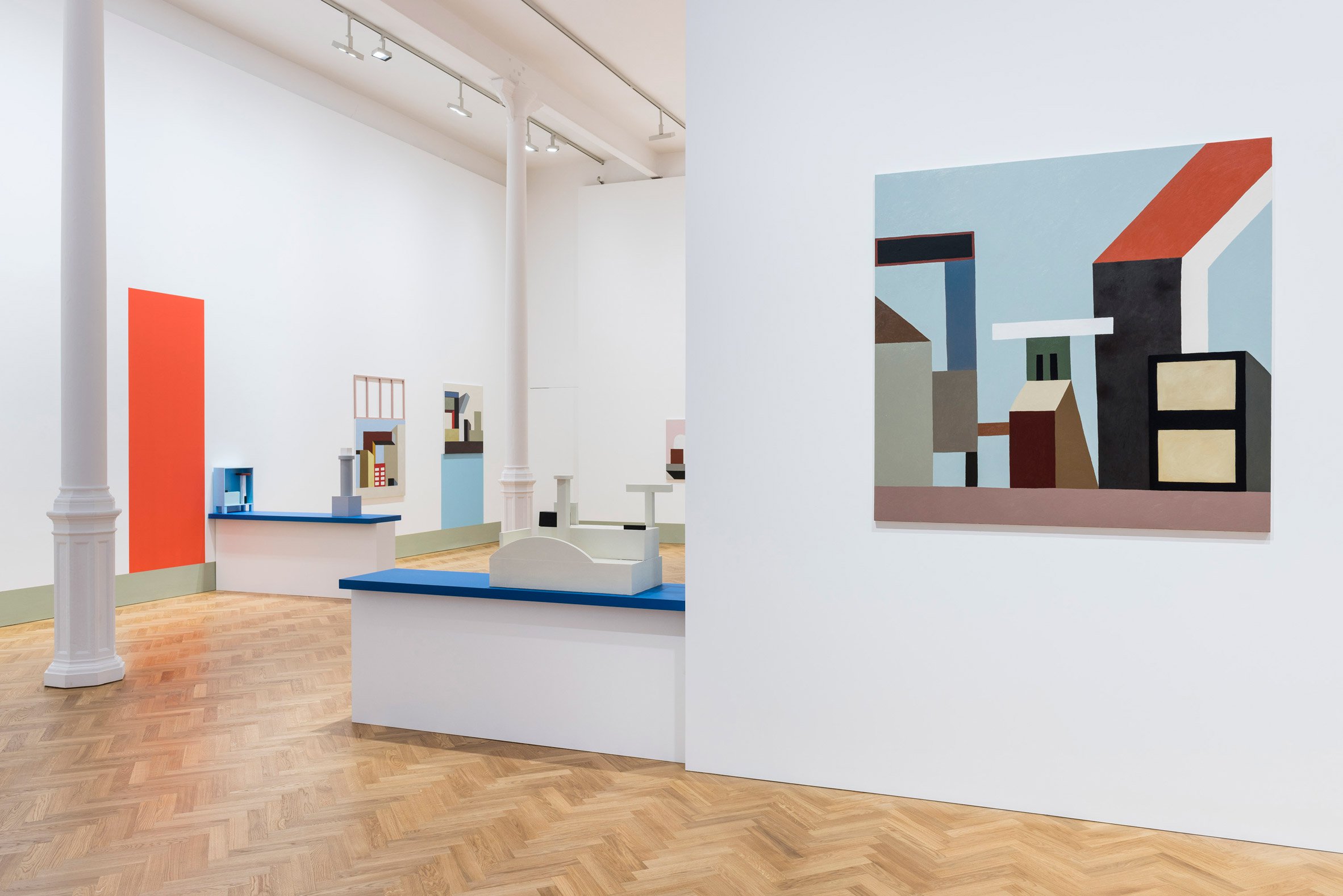
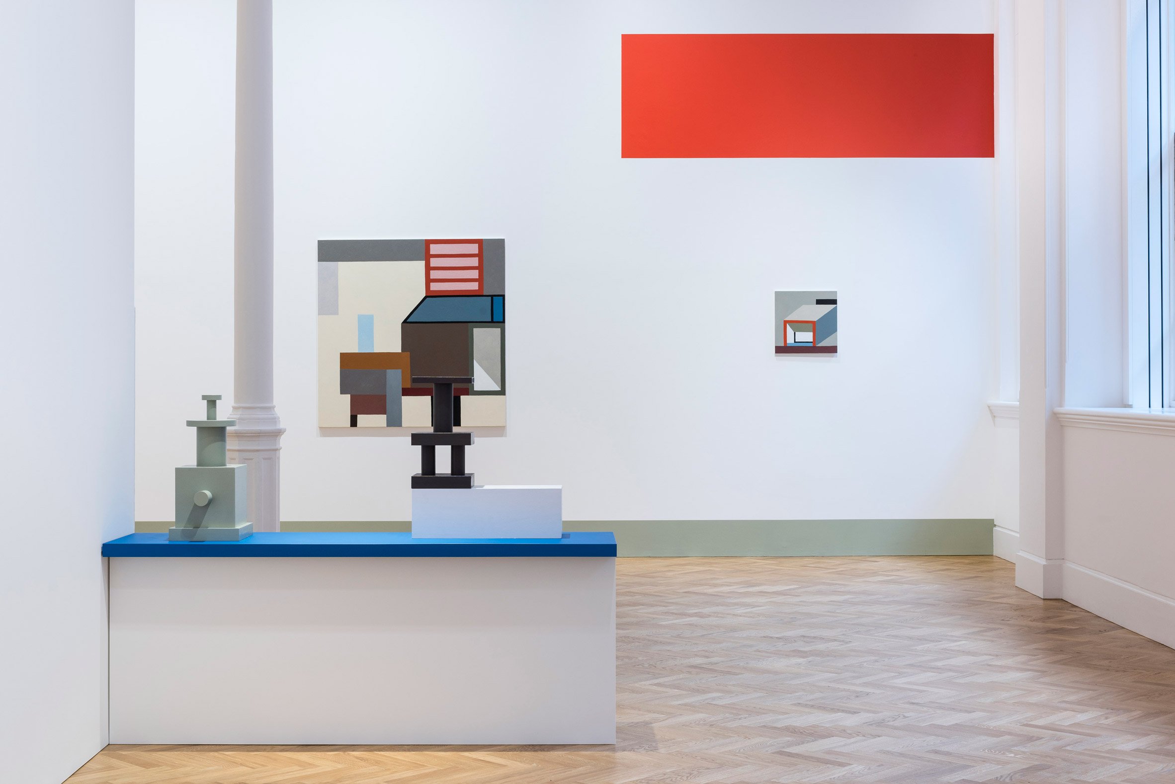
French designer and Memphis Group member Nathalie du Pasquier has created more than 50 new pieces for her first solo show in the UK in 25 years.
The From Time to Time exhibition, which is being hosted by Pace London until 29 July, features sculpture, paintings and drawings, all with the bold geometric forms and colourful contrasts that Du Pasquier’s work is known for. Her wooden sculptures resemble oversized chess pieces, and feature angular shapes reminiscent of buildings and other architectural elements. These are repeated in her still lifes.
Some of the paintings include additional 3D elements, such as doors that fold out, or grid-like sections that extend beyond the edges of the piece.
Du Pasquier has also painted graphic elements on the walls, which frame her works and echo their colours and forms.
“Through the representation, I learned about looking and transforming what I saw into a painting,” said Du Pasquier. “The abstract work is a different kind of position. I become a builder, an inventor.”
From Time to Time is arranged around a central red room, which is hung with some of the designer’s more historic abstract paintings, often including shapes that reference domestic objects.
Du Pasquier – who has described herself as a “painter who makes her own models” – often creates these as 3D pieces before painting them in flat colour on canvas.
“The paintings in the red room are traditional still lifes representing abstract constructions, and you do not see them when you enter the exhibition,” she said.
“What you’ll see, all around the space, is the recent work where I have composed abstract paintings, done in the last two years with three-dimensional elements that show the scars of time.”
“What I want to show in From Time to Time is this continuous shift from one position to another,” she continued” It is in that movement that I recharge the dynamo.”
Du Pasquier, who is set for two more solo exhibitions later this year in London and Philadelphia, has seen a resurgence of interest in her work, along with that of the Memphis Group. The group was founded in 1982 by Ettore Sottsass. The designer, who is self-taught, has created jewellery, furniture and textiles, although shifted her focus to painting in the late 1980s. She launched a 43-piece collection with American Apparel in 2014 which featured her graphic prints and has also created textile designs for Wrong For Hay.
Her intensely patterned Riviera carpet was also revealed to be part of David Bowie’s own extensive Memphis collection when it went on sale through auction house Sotheby’s last year. Postmodernism as a whole has undergone a revival, with its bright colours and bold forms being rediscovered and reinvented.
Lee Broom recently unveiled a po-mo-inspired set of ceramics with monochrome stripes and colourful details, and Camille Walala applied her bold graphics to a collection of homeware for London’s Aria design store.
Source: Pace gallery
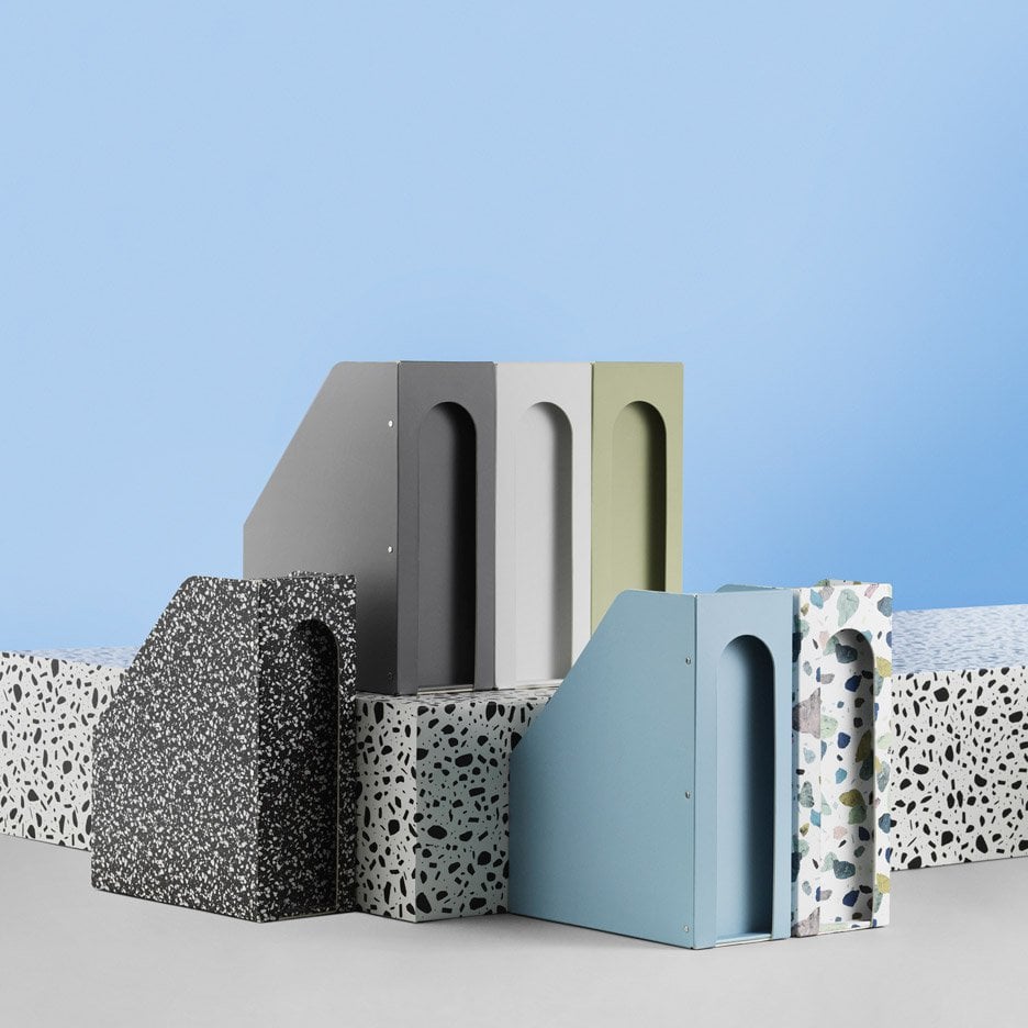
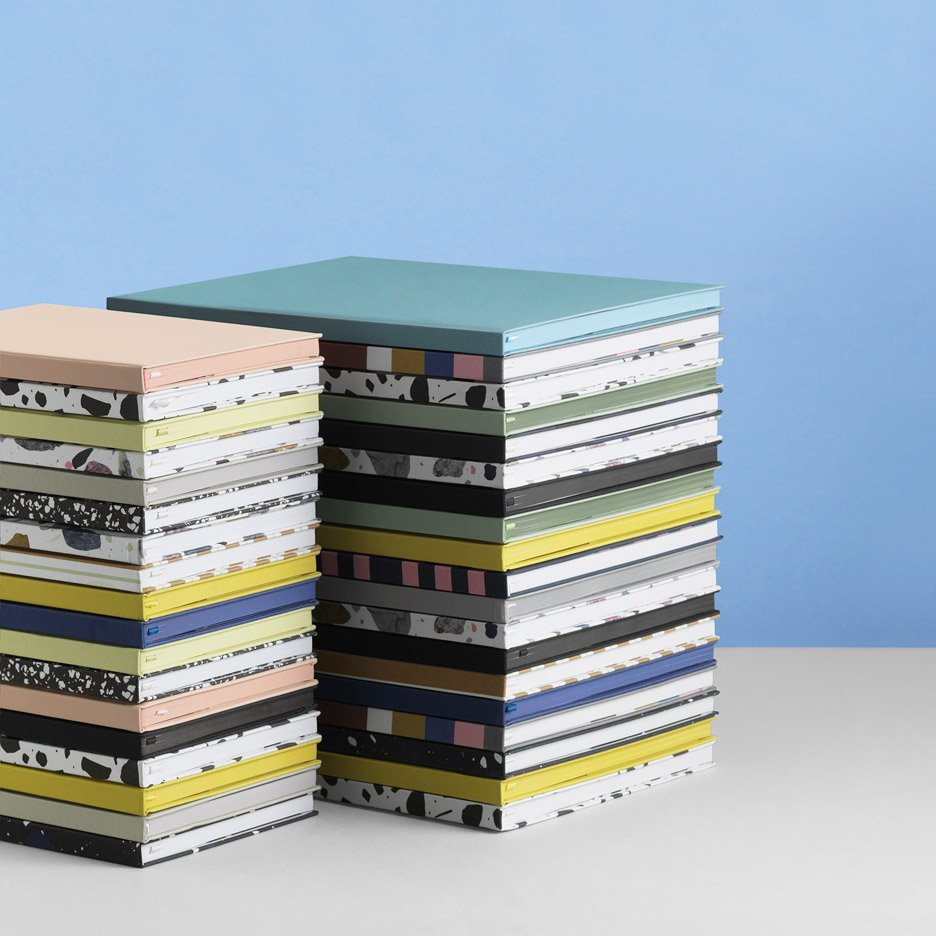
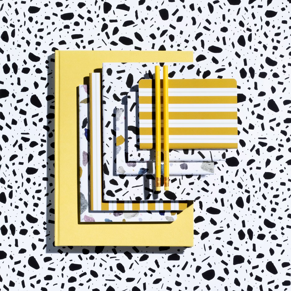
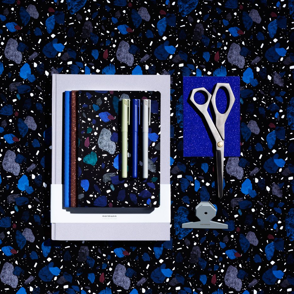
Normann Copenhagen to launch Daily Fiction range of accessories and stationery
Denmark’s Normann Copenhagen is set to become the latest furniture brand to launch a range of stationery and accessories, echoing strategies used by the fashion industry with its Daily Fiction collection (+ slideshow).
Normann Copenhagen’s Daily Fiction collection will go on sale this summer and encompasses more than 200 small objects including notebooks, gift wrapping, stickers, pencil sharpeners, scissors, and a range of pens.
“Personal style is more in focus than ever before,” said the brand. “We tell our individual stories through fashion, music, food, art and interior design.”
“Whether your story is The Refined Story, The Feminine Story, The Creative Story, The Well Crafted & Classic Story or something completely different, Daily Fiction consists of a number of pieces that can be put together in countless ways,” it added.
Source: Dezeen
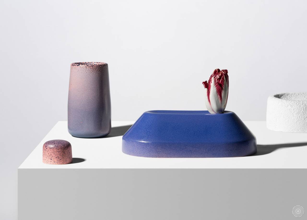
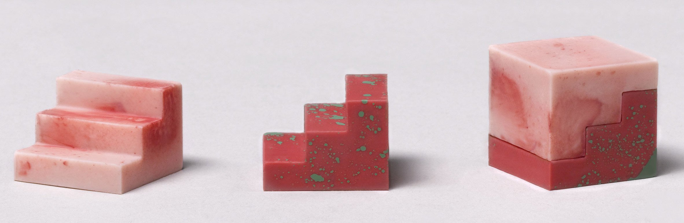
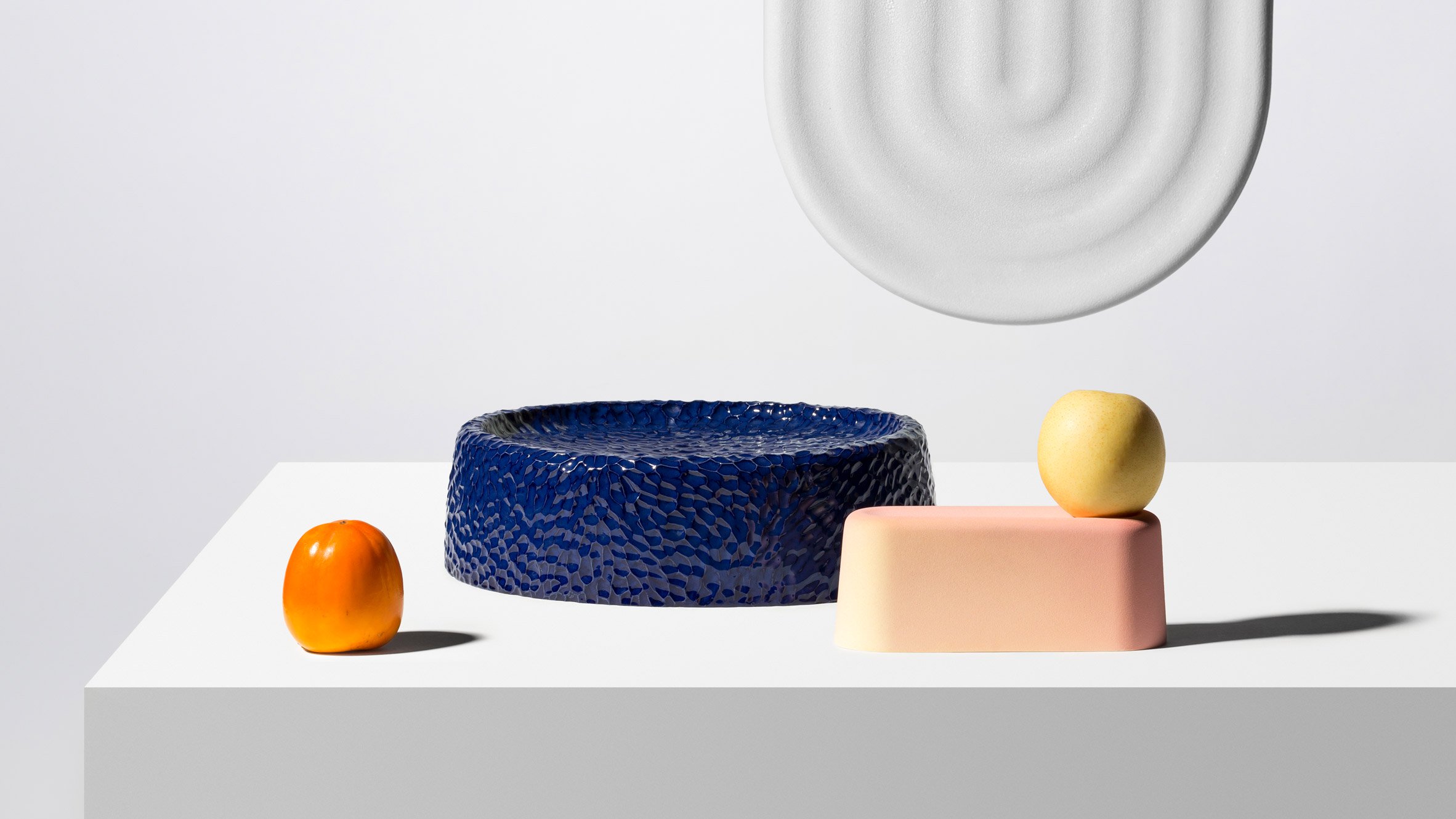
In October 2015, Dimitri Bähler has been invited for a residency at “Workspace at CERCCO”, the Experimentation and Research Center for Contemporary Ceramics of the Geneva University of Art and Design.
That period allowed him to pursue the research to start with “Patterns & Colors” initiated at EKWC, the European Center for Ceramic in 2013 in Den Bosch, the Netherlands.
There, he firstly developed a new technique for decorating a volume. Thanks to the elasticity of a latex textured foil (coming from a milled plastic sheet), a pattern transfer occurs from a surface to a volume. Shortly he could apply a bi-dimensional pattern onto a volume with a high degree of precision.
At the CERCCO, he went into that technique as far as possible, playing with and challenging the volumes, the textures, optimizing the production process and experimenting with various glazes and colors.
These pieces are a range of different volumes with soft and round shapes so that they have the function to be a support for receiving a pattern, a texture through the three different processes. At the same time, these shapes, apart from the vase, are castable thanks to a one piece mold. The result is the limit and the essence of what is achievable through these techniques.
The result is a collection of objects that plays with different variations of volumes, patterns, textures and colors, a kind of dictionary. Always close to an essential abstraction, these shapes can be used as pedestals, fruits bowls, vase, pencils / fruits holders,…
Together, they create a dialogue between functionality and non-functionality, minimalism and decoration, questioning the concept of usefulness in our homes.
Com. Pictures by © Raphaëlle Müller
Assistant: Priscille Tariel
VPT&C has won the GRAND PRIZE of the Interieur design award competition
Some pieces are available at VITRA Schaudepot shop, WALLPAPER STORE or on the webshop.
Dimitri Bähler is a Swiss designer who lives and works in Biel, Switzerland. He is a graduate of ECAL (2010) and the Design Academy Eindhoven, he opened his own studio in 2014. Bähler has been nominated twice for the Swiss Design Awards (2014 and 2015) and has undertaken a number of design residencies around the world, including at the EKWC (European Centre for Ceramics) in the Netherlands and at the Ishinomaki Laboratory in Japan. His work is directed by his own sensitivity to the power of objects, and can often appear spontaneous, yet is underpinned by vigorous research. From one-off pieces to industrially produced designs, Bähler enjoys bringing a sense of naivety and fearlessness to projects.
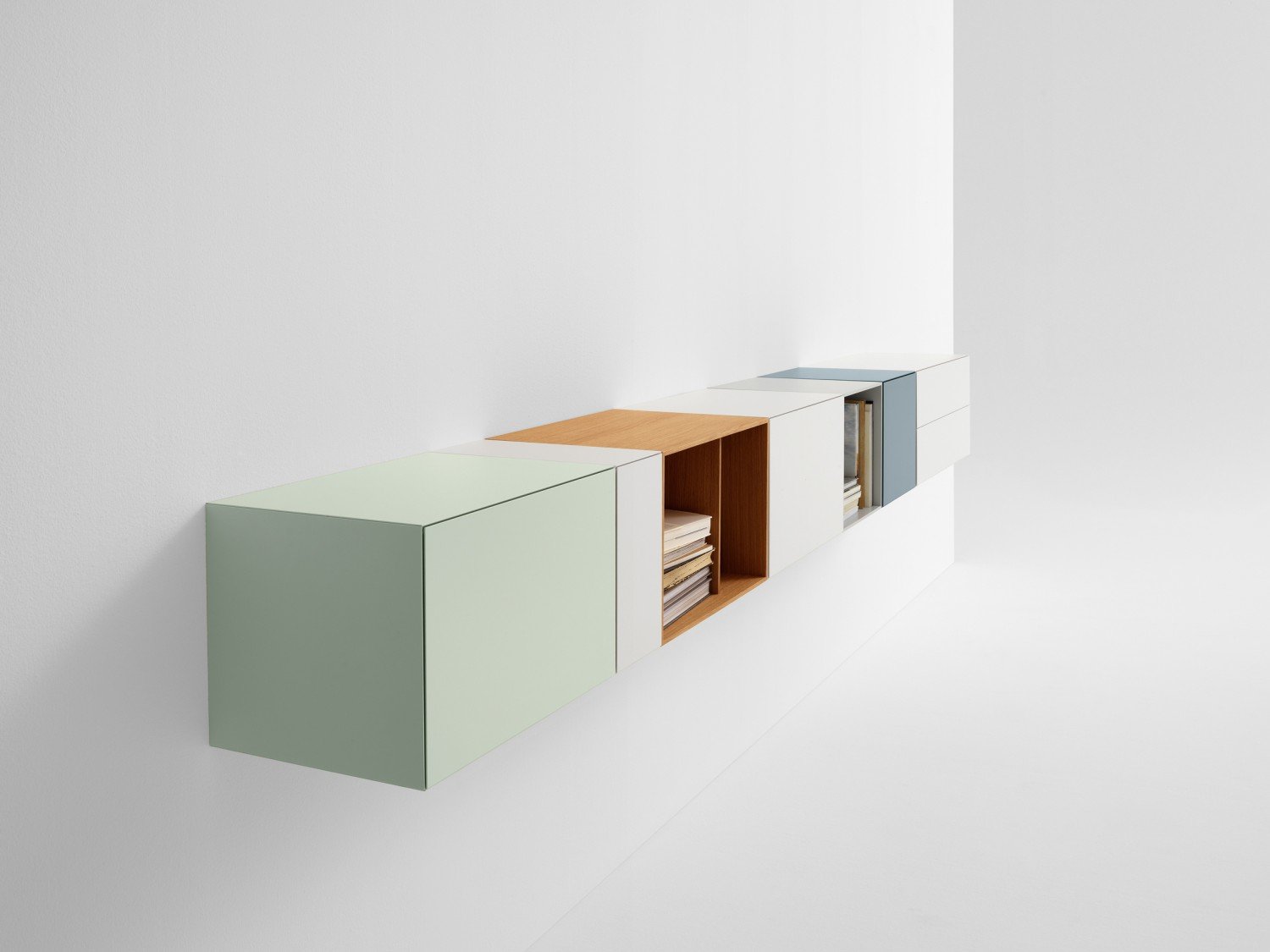
Compose with Vision: design your own cabinet and let your cabinet change and grow with the changes in your life. The Vision line has endless variations and consists of over a hundred components to choose from. Vision was designed from the philosophy that a cabinet composition should be part of the total room architecture. The basis of Vision is a rectangular shape with either drawers, doors or flaps and without handles. The doors have an angular edge for a minimalistic look. There is a great variety in depths, height, width and lots of colours and veneers. Fronts close using a push-touch system.
www.pastoe.com
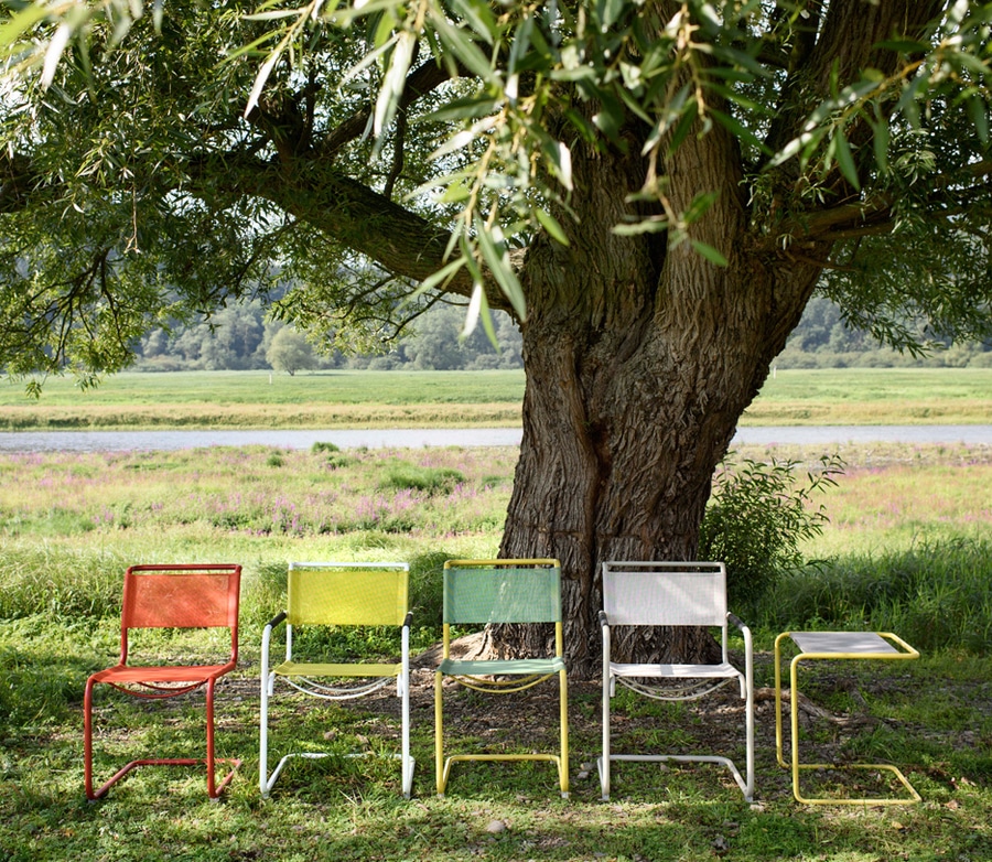
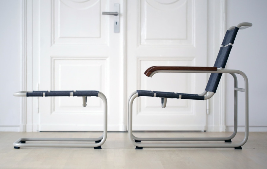
Thonet is launching an outdoor range of classic chairs by Mart Stam, Marcel Breuer and Ludwig Mies van der Rohe, reveals CEO Thorsten Muck in this exclusive movie Dezeen produced for the German brand. Called Thonet All Seasons, and consists of four tubular steel chairs originally designed in the 1920s by teachers at the famous Bauhaus art school.
Stam’s original cantilever chairs are included in the collection – the S 33 and S 34 – together with Breuer’s S 35 lounge chair and Mies van der Rohe’s curvaceous S 533.
“We were missing our classic tubular steel products in a condition where they were suitable for outdoor use,” says Muck in the movie, which was filmed at Thonet’s factory and headquarters in Frankenberg, Germany. “We chose the really iconic pieces.”The chairs feature ultraviolet-resistant mesh upholstery on steel frames treated with a special weather-resistant coating called ThonetProtect.
“We use the same steel as our classic pieces, but we treat it in a very special way with a surface that is resistant against harmful outdoor environments,” Muck explains. “They can last for decades.”
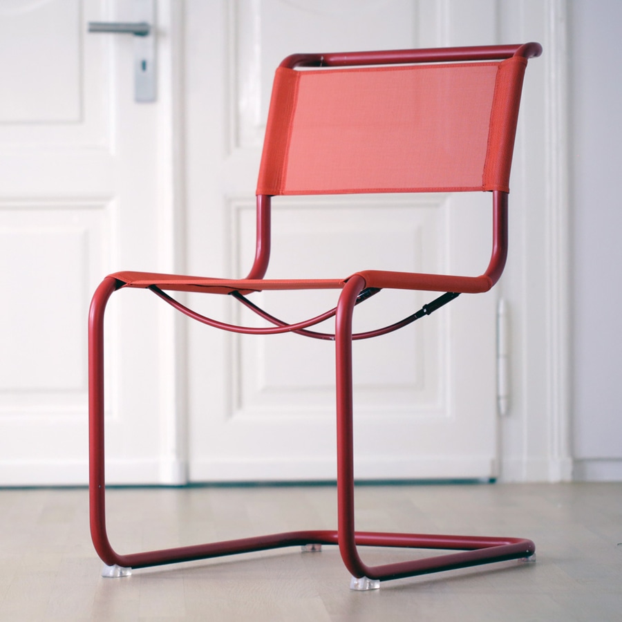
Customers will be able to mix and match frame and upholstery colours, while the S 34 and S 35 chairs will be available with either mesh or wood armrests. “You are able to combine different colours to produce very individual furniture,” Muck says.
The frames of the chairs are produced at Thonet’s Frankenberg factory by bending three-metre lengths of tubular steel.
Although the furniture is machine-bent, each angle must be checked and adjusted by hand due to slight differences in the tolerance of the metal.”The tubular steel comes in a size of seven metres, and is polished and then cut down,” Muck explains. “Every single chair is approved by the person who operates the machine – a person has to control the work of the machine to make it really perfect.”
Thonet was founded by German carpenter Michael Thonet in 1819 and became famous for its steam-bent wood furniture, especially the iconic No 14 cafe chair that it still produces today as the 214 chair. The company expanded into bent steel furniture in the 1920s.
“Everything started with the bent-wood furniture and the Vienna coffee house chair,” Muck explains.
“Then the teachers of the Bauhaus came to Thonet to ask if we were able to bend tubular steel in the way we were able to bend wood.”thonet
www.thonet.com