Categorie: Geen onderdeel van een categorie
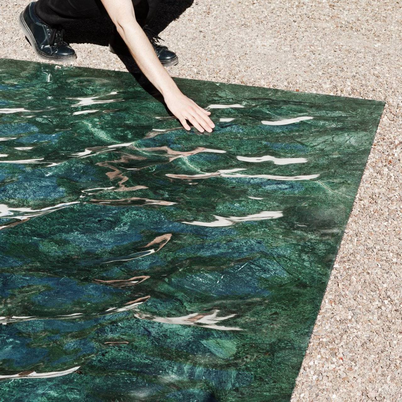
French designer Mathieu Lehanneur has sculpted marble into a convincingly rippling pool for his Petite Loire installation, created for this year’s International Garden Festival (+ slideshow).
The 7.5-metre-long patch has been created from a single section of hand-polished green marble, and was designed using 3D software.
The material has been carved into realistic waves that replicate water that has been “gently ruffled” by the wind.
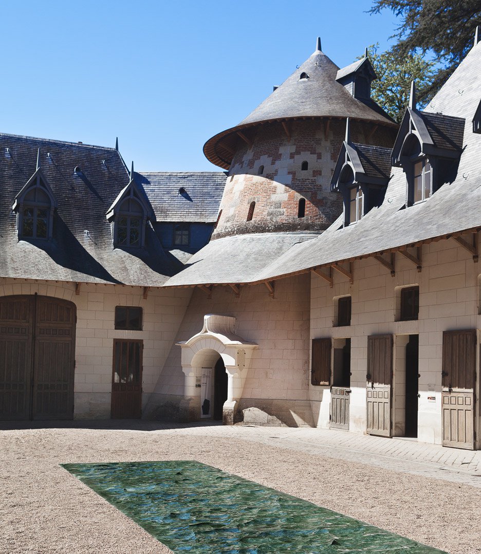
The piece reflects on the hidden presence of the Loire river, which flows beneath the courtyard of the Domaine de Chaumont-sur-Loire Centre D’Arts et de Nature, where the installation is presented.
“I wanted to address the garden with water as my muse,” said the designer. “The water whose presence we sense even before we first catch sight of it below the chateau, flowing uninterrupted to the sea.”
“Petite Loire is a freeze-frame, the river’s perpetual movement caught in a frozen, fossilised moment,” he added. “A few dozen metres above the river’s natural level, Petite Loire cuts cleanly through the garden’s surface, delving into the soil to reveal a fluvial relief, both vertiginous and practicable, in green marble.”
“Everything is liquid in this space, evanescent, enlightened, and yet it is executed in a material that is one of the most solid imaginable,” said the designer.
Lehanneur also played with perceptions for his Clover street furniture – installed in Paris last year – using digital machining to blend different types of wood into giant, spindly stems.
The Petite Loire installation is being shown in the courtyard of the Domaine de Chaumont-sur-Loire Centre D’Arts et de Nature in France, and will remain on display until 2 November 2016.
story by Dezeen
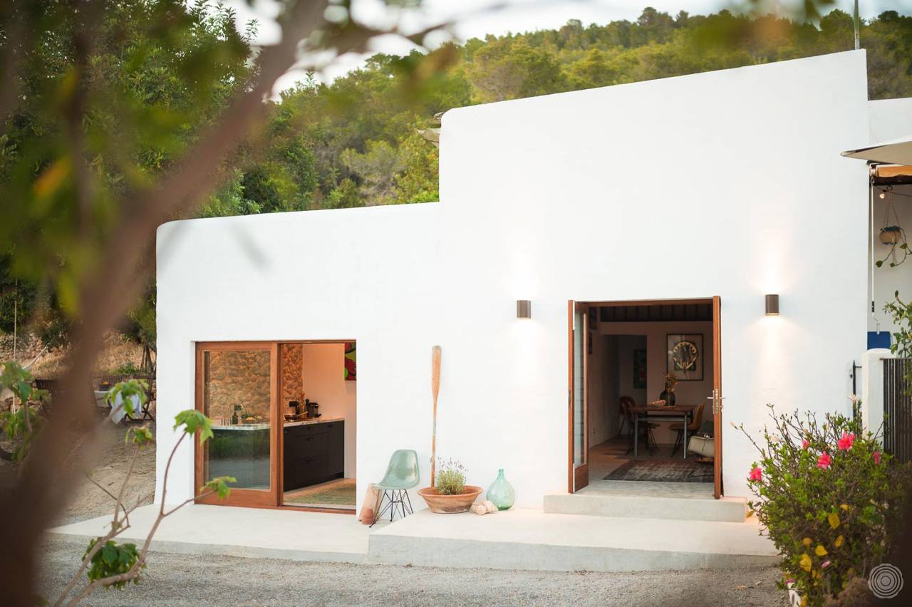
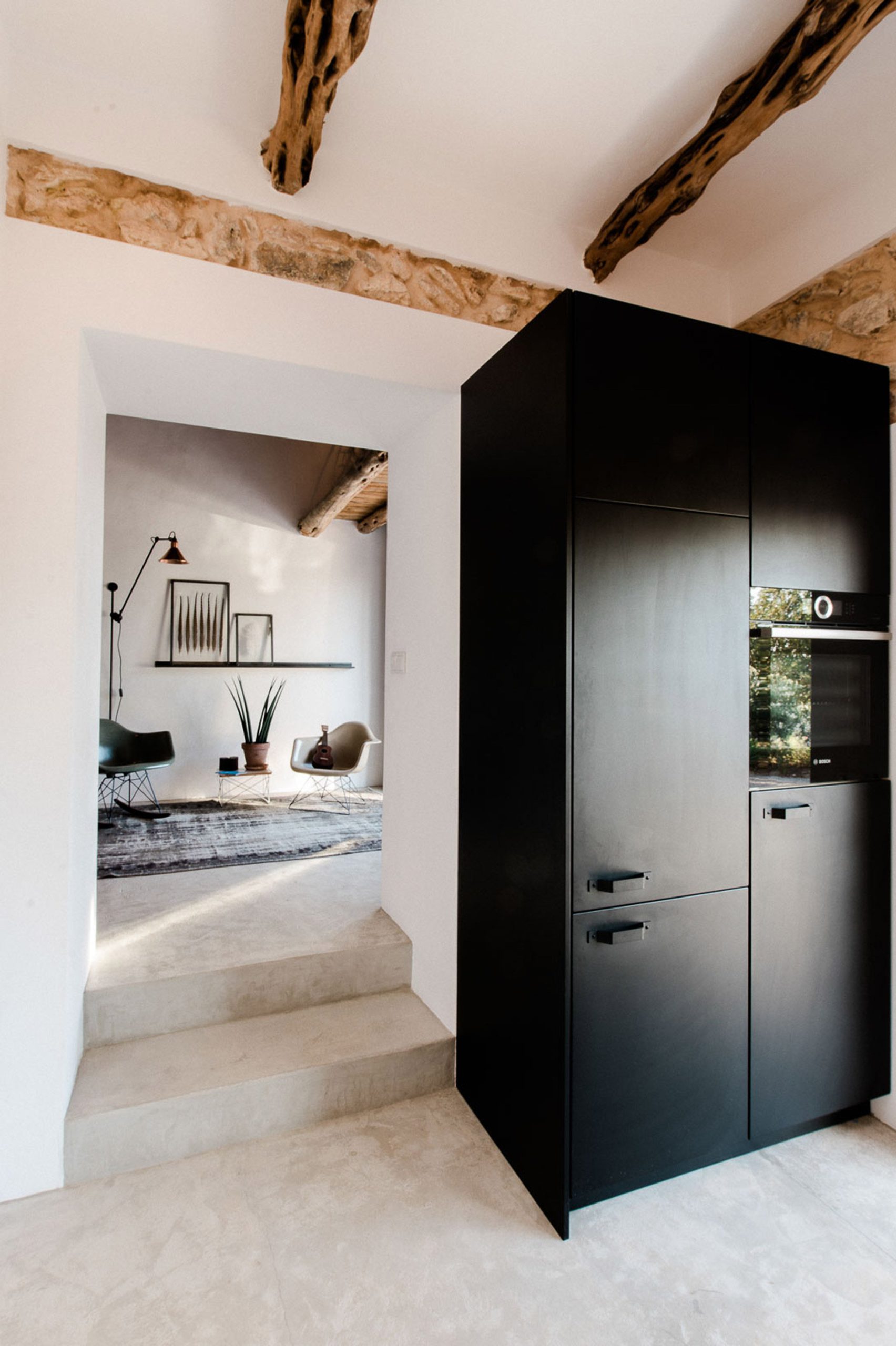
Amsterdam-based Standard Studio has transformed a stable into an off-grid showroom and home for the owners of an interior design shop in Ibiza.
Nestled within the mountains at the north of the Balearic island, the 45-square-metre house named Casa Campo comprises two bedrooms and one bathroom.
The cottage doubles up as a showroom, with items of furniture and decorative pieces available to buy from the client’s shop, Ibiza Interiors.
Described by Standard Studio as a “self-sustainable house”, the electricity and underfloor heating is powered by solar panels located on the roof,
while a private well supplies the cottage with water.
Exterior walls made from concrete are painted with white chalk paint, a typical method used on Ibizan houses to reflect the sun.
“The result is a fantastic contemporary residence where contrast plays a big role; old and new, sleek and rustic, light and dark,” said the studio.
“At the same time there’s a certain balance as well, and everywhere you look something is happening.”
story via dezeen
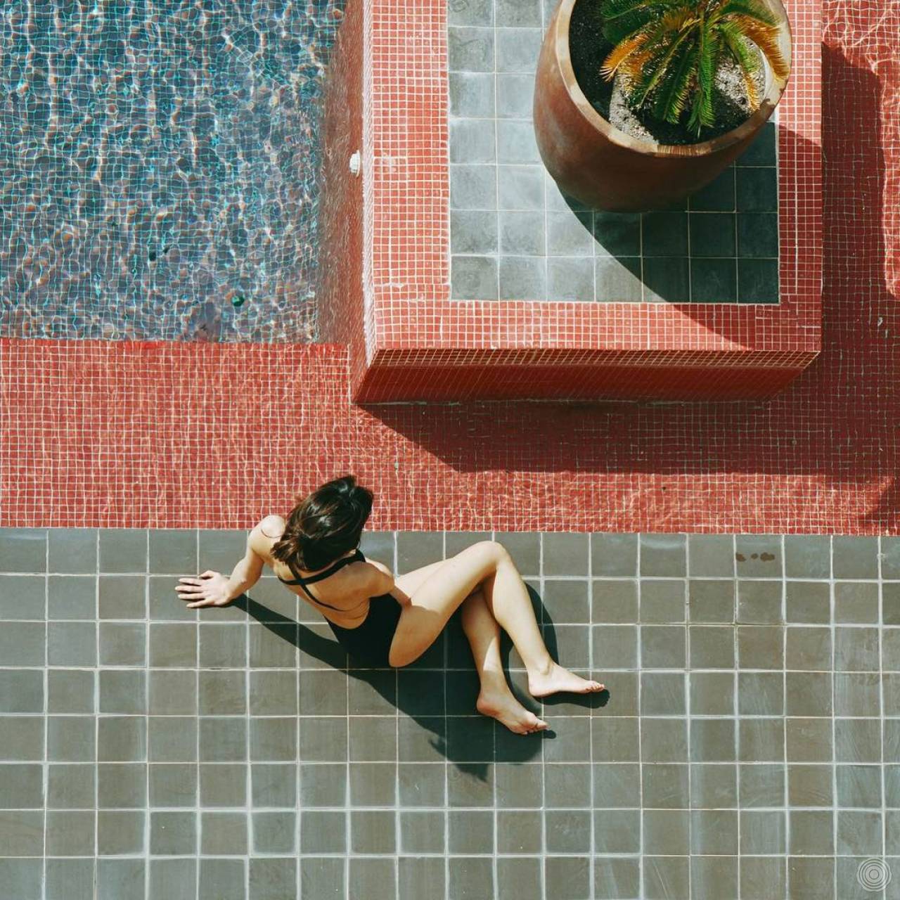
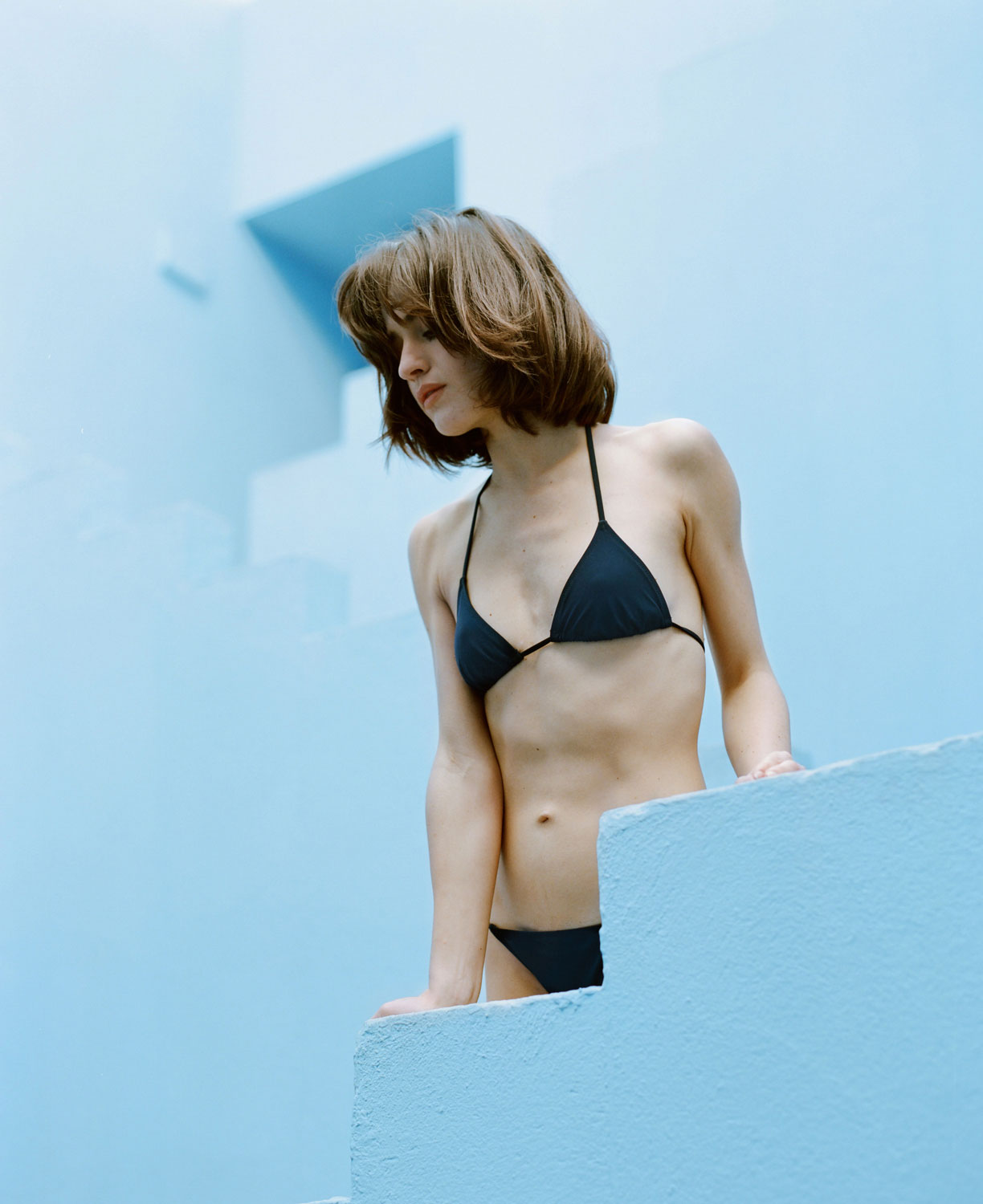
Lido is an independent swimwear label established in spring 2017. Its name refers to an island in Venice, one of Europe’s first sea bathing facilities. The brand is born out of a desire to re-contextualize the beach experience through a modern eye, with intelligent urban women in mind. Timeless, inspired by an aesthetic rationalism, Lido is reinventing functional, contemporary beachwear. The collection is entirely designed and manufactured in Venice—Italy.
Their instagram is supernice, check it out.
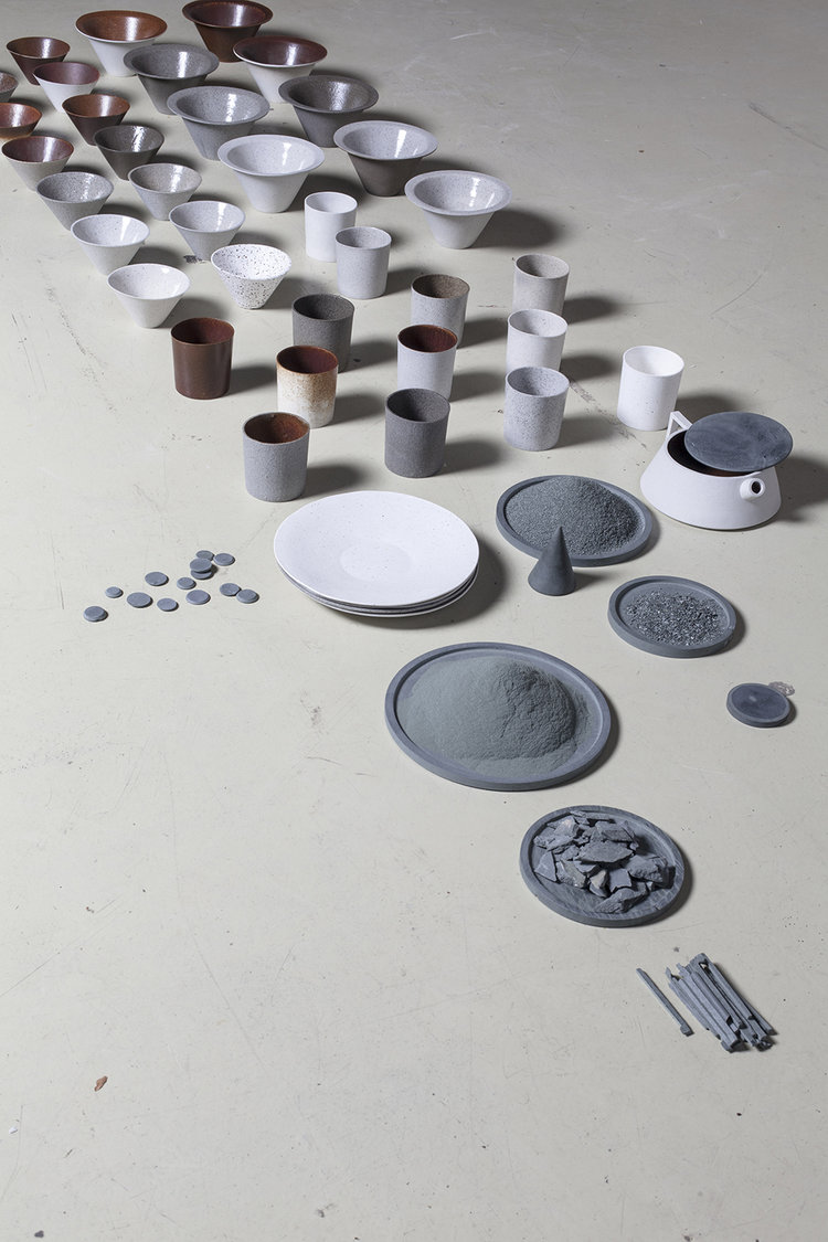
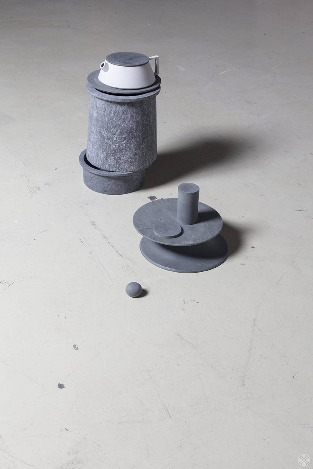
Maddalena Selvini started with the S-pot as a nostalgic project, inspired by a lost wintertime with people gathered around the chimney with food rumbling on a stove top. From this image, the idea emerged to create a set of pots and tableware that can behave like a stove. The material used is called “Pietra Ollare”, a soft stone from Valtellina, in the north of Italy, where each piece is handmade according to an old craft that is slowly being forgotten. The stone naturally retains heat making it the perfect tool for cooking and keeping things warm.


Adidas is getting serious about its sustainability initiatives and showing that going green doesn’t have to make customers blue.
With new ocean-inspired coloring, Adidas is releasing “Parley” versions of its most popular Boost running shoes: the Ultraboost, Ultraboost X, and Ultraboost Uncaged.
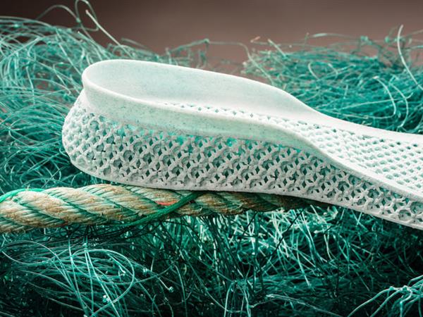
Parley is Adidas’ partner in the Parley A.I.R Strategy, which turns ocean plastic waste into thread that is woven into running shoes. Each shoe uses an average of 11 plastic bottles per pair and incorporates recycled plastic into the shoe’s laces, heel webbing, heel lining, and sock liner covers.
“The new additions to the adidas x Parley collection are another step in our journey to creating one million pairs of Ultraboost from up-cycled marine plastic,” Mathias Amm, a product category director at Adidas, said in a statement.
Adidas previously released an ocean plastic waste sneaker, but it was a limited release and more of a proof of concept. These new Boost sneakers are a step forward as Adidas seeks to use more sustainable materials moving forward in its regular offerings.
Adidas reiterated its commitment to green materials in its recently released sustainability report, which highlighted that the company is on track to use 100% sustainable cotton by next year. It also said that it saved 70 million plastic shopping bags by switching to paper bags in its stores, and it detailed a commitment to make the new Adidas MLS uniforms with Parley recycled plastic.
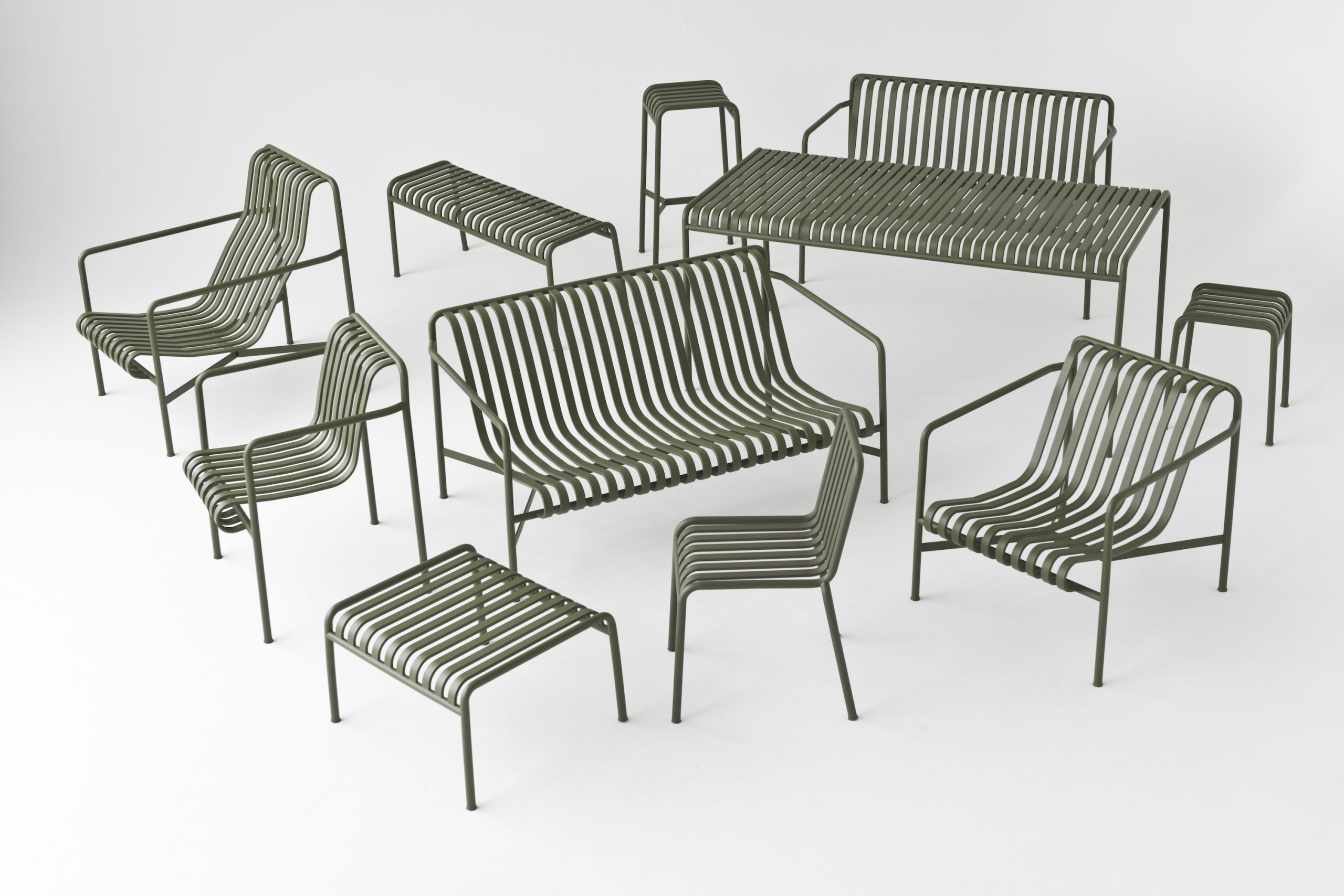
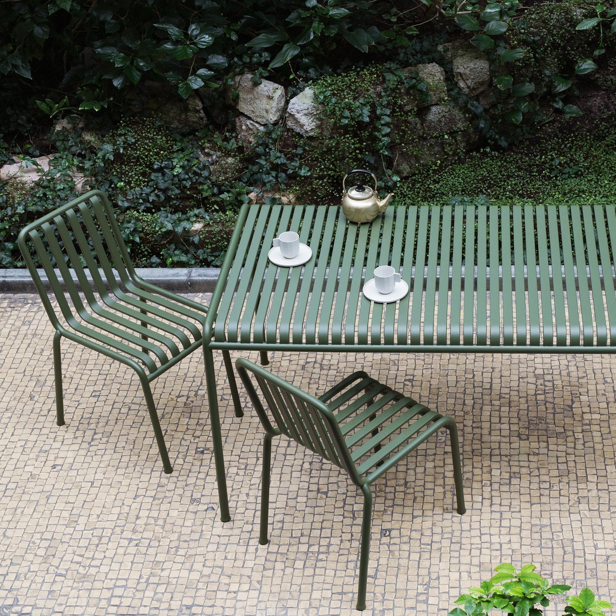
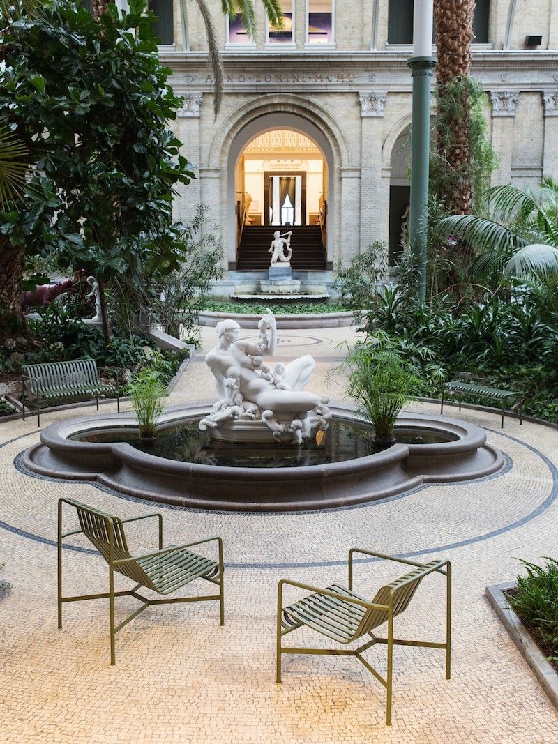
Palissade is a collection of outdoor furniture designed by Ronan and Erwan Bouroullec for HAY. The collection was designed to fit a wide variety of environments: cafés, restaurants, gardens, terraces and balconies. The construction allows a wide range of typologies with a common formal language. From stools and benches to chairs and tables, lounge chairs and sofas – the collection comprises 13 different elements, united not only by their graphical image but also by their common characteristics: they are strong without being bulky, elegant without being fragile.
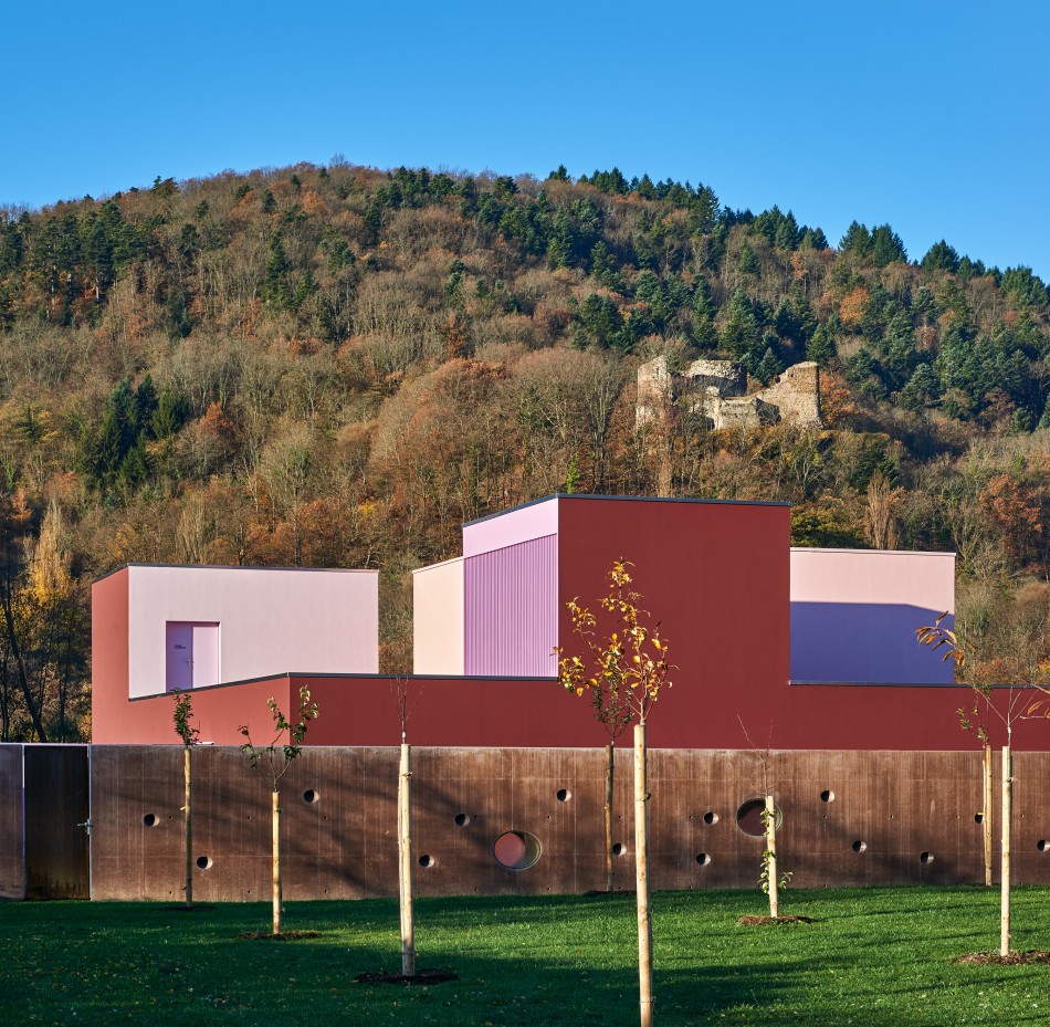
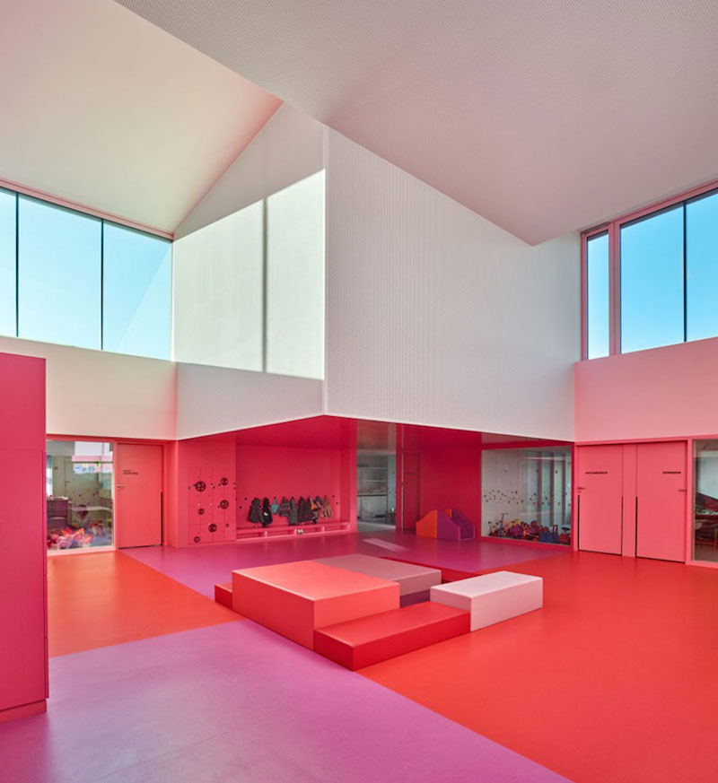
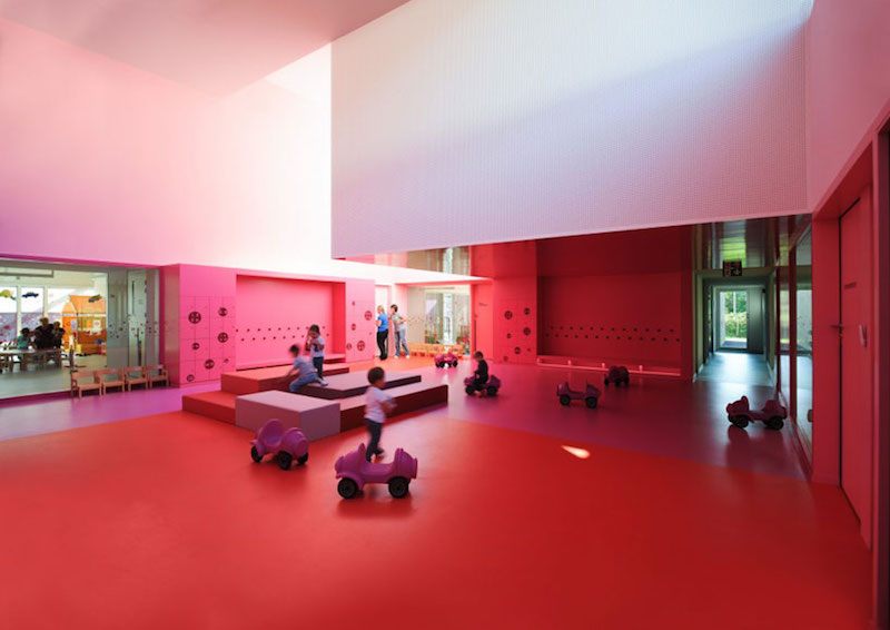
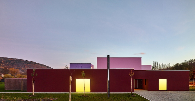
The building marks the entrance to a small village nestling in a valley in Alsace.
A 14th-century castle dominates the site from the nearby hillside. The day nursery echoes the orthonormal geometry of the fortified castle.
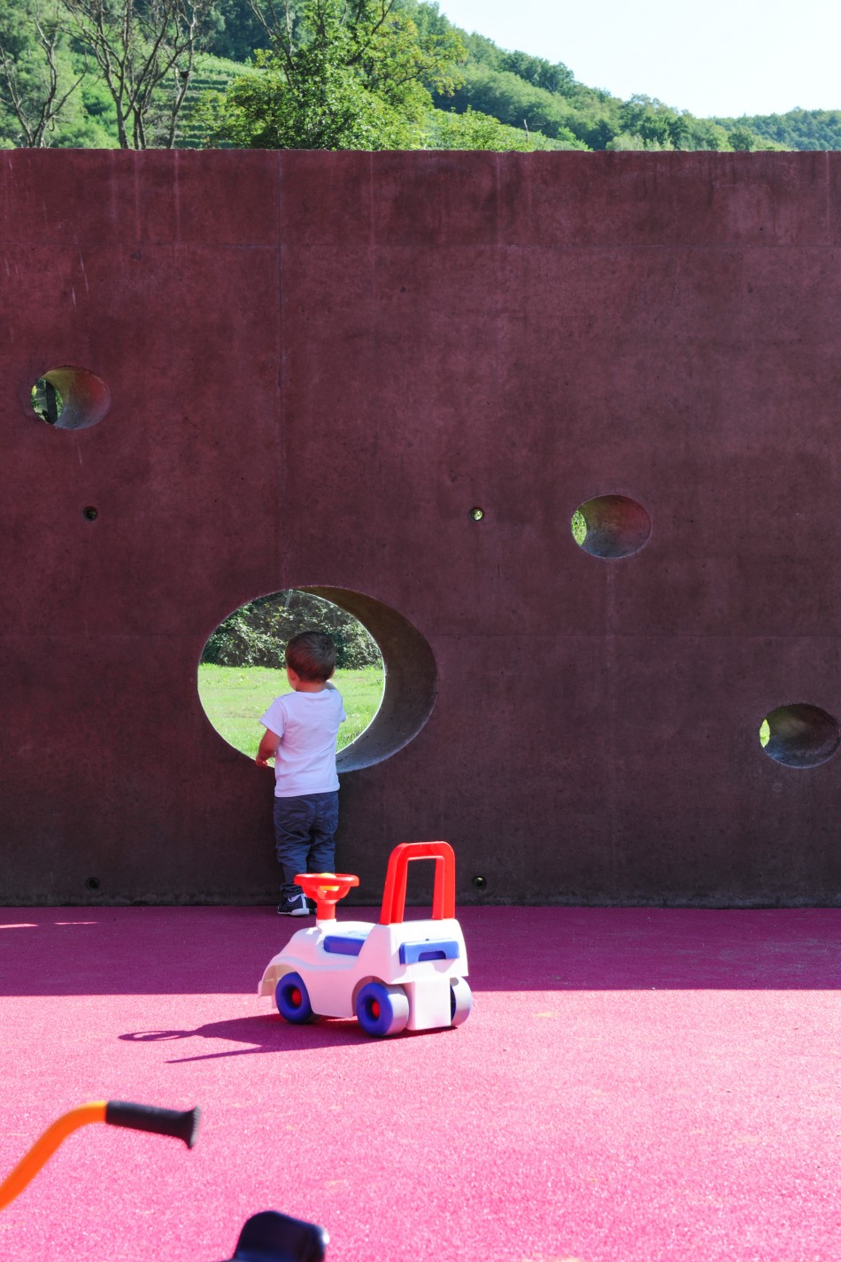
A perimeter wall with openings like on a castle wall protects the children’s playgrounds. This spatial arrangement offers views of the rounded outlines of the Vosges mountains. The principle of the strictly rectangular plan is an arrangement of successive crowns containing the elements of the project.
These layers give depth to the project overall. The heart of the building is formed by a central space which emerges at double the height and plays with natural light like a kaleidoscope. This almost cubic volume condenses a host of faces ranging in colour from pink to red.
The matte and shiny colours resonate, shaping the space to make it richer and more subtle. The multiple transparencies installed between the different layers give an indication of the depth of the building. There is abundant natural light throughout, captured by skylights emerging from the overall volume. The building appears in the landscape like a fragmented monolith where the play of solids and hollows is reminiscent of something like a Lego model of a castle. The building is surrounded by sixty-eight apple trees which hark back to the local agricultural landscape.
website architect
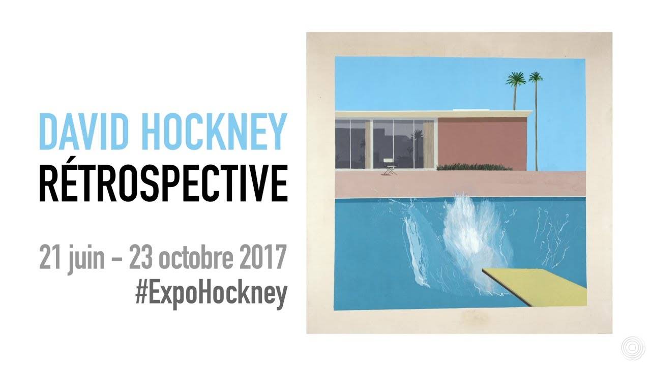
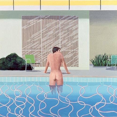
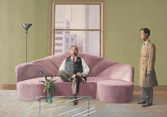
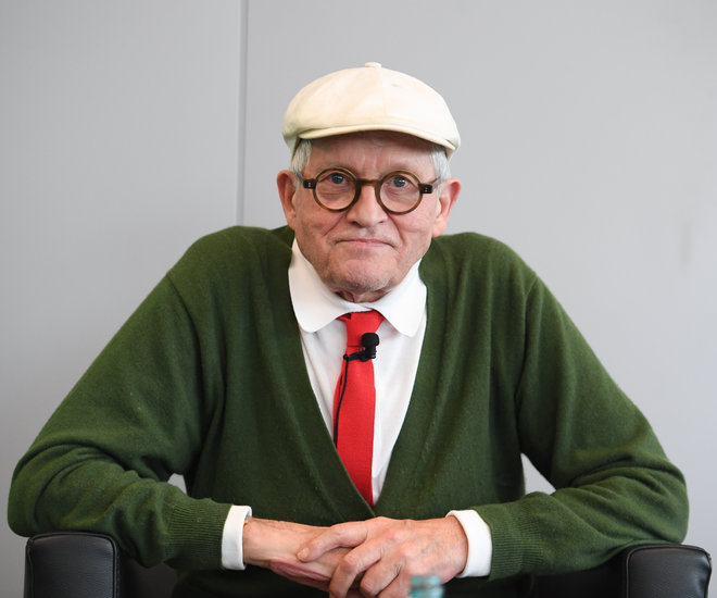
In collaboration with London’s Tate Britain and the Metropolitan Museum of New York, the Centre Pompidou is to present the most comprehensive retrospective ever devoted to the work of David Hockney. The exhibition celebrates the artist’s 80th birthday, retracing his entire career through more than 160 works (paintings, photographs, engravings, video installations, drawings and printed works), including his most iconic paintings (swimming pools, double portraits and monumental landscapes) and some of his most recent creations.
David Hockney
Exhibitions
21 June 2017 – 23 October 2017
from 11 a.m. to 9 p.m. or from 11 a.m. to 11 p.m.
Centre Pompidou, Paris
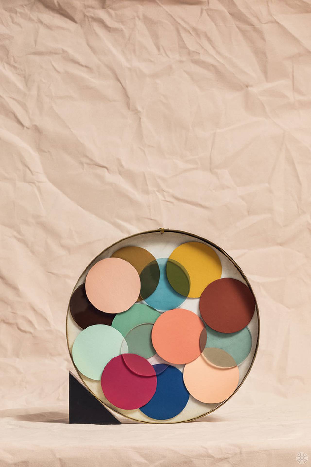
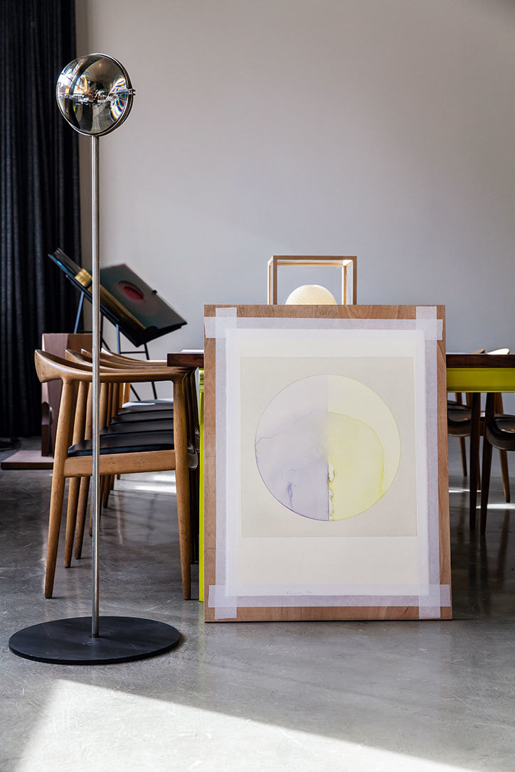
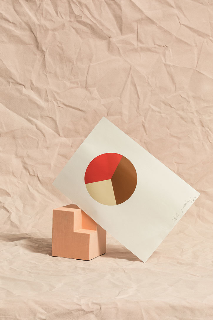
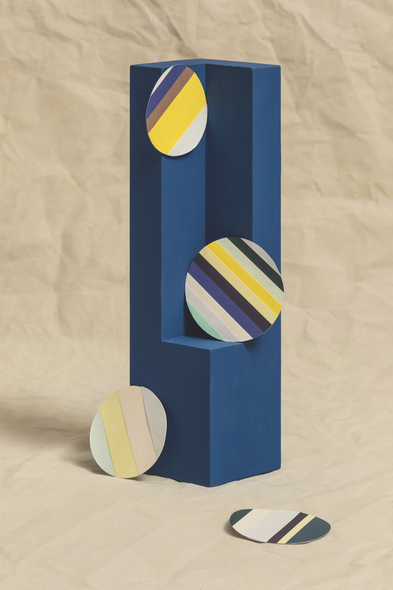
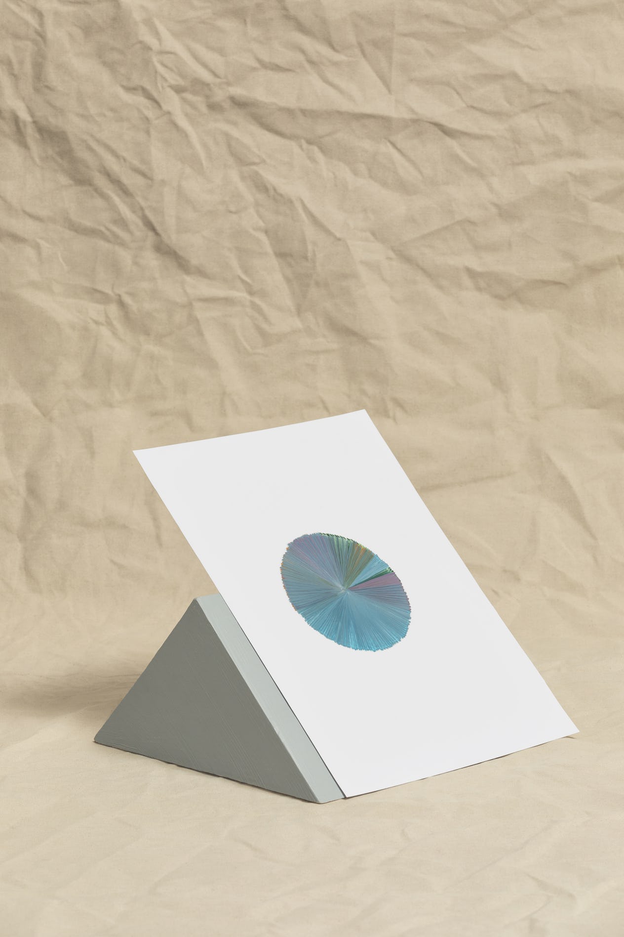
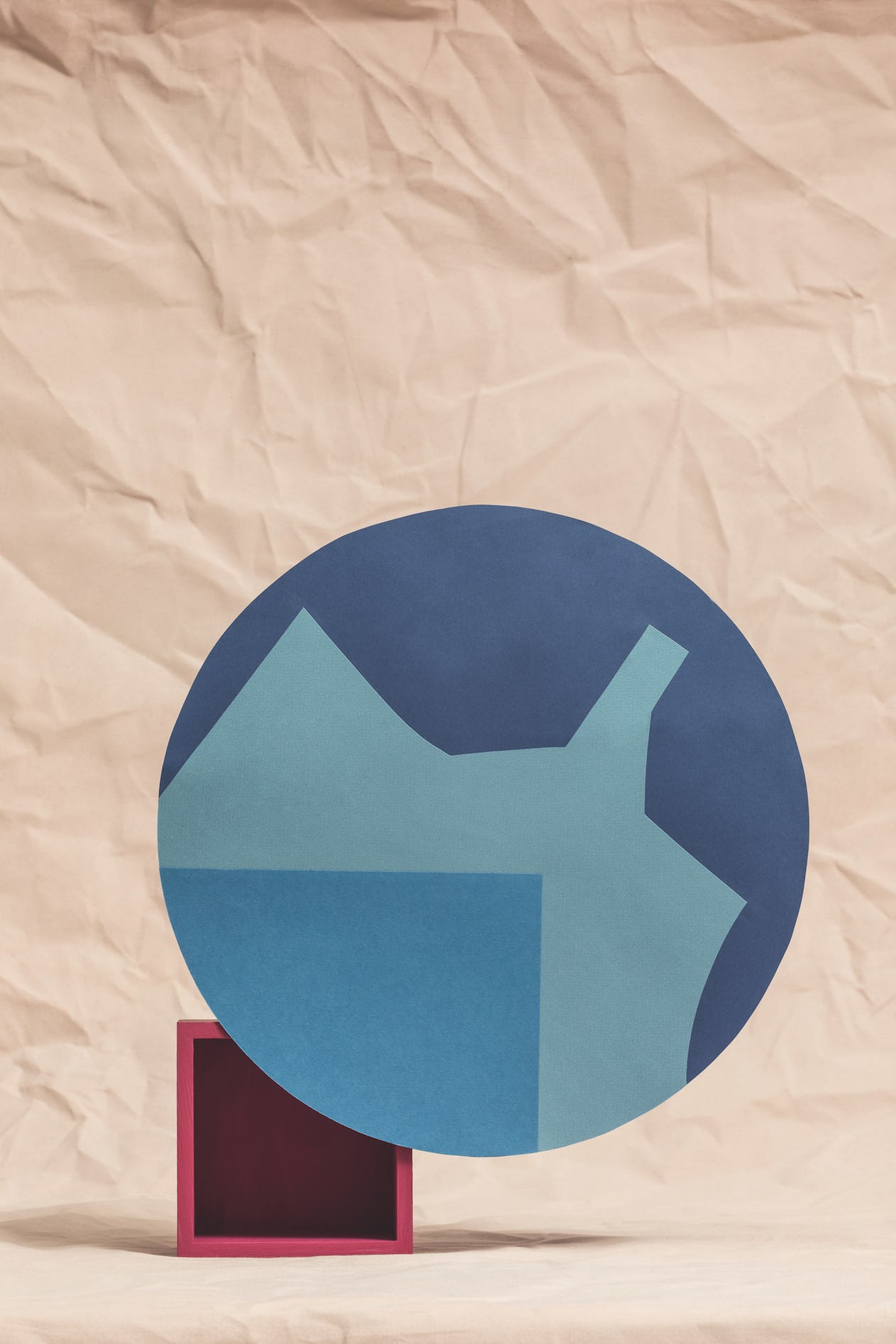
For a feature in Disegno #14, 11 contemporary designers and artists were inited to take a simple colour test. Devised by the Bauhaus master Johannes Itten, the test was designed to reveal a person’s subjective colour preferences.
In 1928, art students at the Itten School in Berlin were set a new exercise. The school’s founder Johannes Itten (1888-1967) had asked his students to paint preset colour combinations within circles, but unrest soon set in. “We all think that the combinations you assigned are not harmonious,” Itten remembered the class telling him. “We find them discordant and unpleasant.”
Itten, a former Bauhaus tutor and one of the 20th century’s leading colour theorists, was surprised by the discontent. In response, he gave his students license to paint whatever combinations they found harmonic. “After an hour, I had the finished sheets spread out on the floor for inspection,” Itten wrote in his 1961 book The Art of Color. “Each student had painted several original, closely similar combinations of his sheet. But each student’s work was very different from the others. It was realised with astonishment that each had his own private conception of colour harmony […] This is subjective colour.”
This exercise in subjective colour forms only a small portion of The Art of Color, but its implications were far-reaching. “Any suggestion that subjective colour may reveal character or mode of thought and feeling should be avoided,” cautioned Itten, but he nonetheless acknowledged the significance of his findings for practitioners. “[Designers] sometimes tend to be guided by their own subjective colour propensities,” he wrote. “This may lead to misunderstandings and disputes, where one subjective judgment collides with another.”
Itten called for sensitivity to individual design challenges. “For the solution of many problems […] there are objective considerations that outweigh subjective preferences,” he wrote. A butcher’s shop should be decorated in colours that emphasise the redness and freshness of the meat; a Christening requires flowers in light, delicate shades; spaghetti packaging ought not to be designed with blue polka dots, for the “form and colour features are in conflict with the theme.”
March 2016 marks the 50th anniversary of Itten’s death, but his observations around the relative objectivity and subjectivity of colour remain vital to designers. To mark Itten’s contribution to the field, Disegno invited 11 contemporary designers, artists and architects to take Itten’s original test. The resultant artworks, curated across the following pages by the Milan-based design practice Studiopepe, display the complexity of any creative practitioner’s relationship to colour.
Source: Designo